Ads for automobiles nowadays often highlight performance capabilities and premium vibes. The formula is familiar: a glossy, high-end interior; state-of-the-art technology; dramatic lighting; and a stylish exterior shot gliding through an empty mountain road. And yes—commercials almost always feature a stunning vehicle, photographed in a way that makes it look like the only sensible choice in the market.
Modern automotive advertising is, in many ways, light years ahead of the cheesy commercials and print ads of decades past. But here’s the twist: those older advertisements were still remarkably effective. They didn’t have cinematic CGI budgets, social media targeting, or influencer partnerships—and yet they captivated readers through pure print-media craft: bold headlines, carefully structured copy, and visuals engineered to stop your eyes mid-page.
The most distinctive feature of classic vehicle advertising is the sense of humor—often sharper, riskier, and more memorable than what you see today. The best of these ads made customers laugh out loud, but they also did something more important: they taught you something about the car, the buyer identity the brand wanted to reach, or the competitor the company wanted to outshine. They weren’t “funny for fun’s sake.” They were funny with intent.
And let’s not pretend great advertising doesn’t sell cars. Many companies succeeded in converting attention into purchases simply because their ads were clever, bold, and unforgettable. Below are some of the funniest car advertisements from the past—rearranged into themes so you can see the patterns behind the humor, not just the punchlines.
Why Vintage Car Ads Still Hit So Hard (An Expert Lens)
Vintage automotive ads succeed because they rely on fundamentals that never go out of style: clarity, contrast, and human psychology. If you look closely, most of the best ads below use one (or more) of these tactics:
- Exaggeration with a point: absurd imagery that still communicates a real benefit.
- Self-awareness: brands admitting a weakness or leaning into a stereotype to build trust.
- Competitive jabs: direct or indirect comparisons that make the brand feel confident.
- One strong idea: a single message delivered cleanly—no feature dumping.
- Story in one frame: the image itself contains a narrative, so you “get it” instantly.
Now, let’s dive in—starting with ads that use “technology talk” and feature pride in a way that still feels relevant today.
Theme 1: When the Ad Teaches You Something (While Making You Smile)
Before Computers, There Was…
Today, cars are computers on wheels. Many key systems are controlled electronically—engine management, braking logic, traction systems, climate control, and often entire infotainment ecosystems. That’s not inherently bad; modern technology helps manufacturers build vehicles that are safer, more efficient, and more consistent. Tesla’s cars are living proof of how software and sensors can enhance road safety when executed properly.
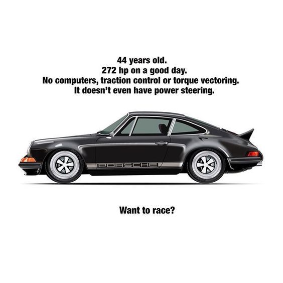
Vintage automobiles, of course, weren’t built around software-driven experiences, and in pure “technology” terms they often can’t compete. The issues they face are many: fewer electronic conveniences, fewer modern safety layers, and a different standard of reliability. But this ad reminds us of something important: when a car has strong fundamentals—proportions, presence, and emotional appeal—it can age beautifully.
And this Porsche? It’s the kind of machine enthusiasts will call a “monster at heart.” Many would argue it has aged like fine wine: not because it has the most features, but because it has the kind of design character that modern cars often struggle to replicate.
Expert takeaway: Not every ad needs to list specs. Sometimes an ad sells the idea that a car is timeless—and timelessness is its own kind of value.
Effective Advertising
This Porsche advertisement is excellent—strong visual, confident tone, and copy that understands what the audience wants to hear. But the real twist is the historical price context. This Porsche was available for under four thousand dollars back in the day. That sentence alone feels unbelievable now.
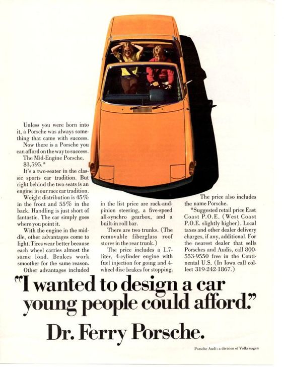
It’s described here as an iconic two-sports vehicle, the Porsche 911 Mid-Engine—an identity statement designed to make the car feel both attainable and “serious.” The brilliance is that the ad doesn’t just sell the car; it sells the dream that a younger buyer could realistically join a premium brand’s world.
We’re envious, honestly. Many of us will never experience a chance to buy a Porsche at that kind of price. And that’s part of what makes vintage ads fascinating: they reveal how the market, pricing, and brand accessibility have shifted over time.
Expert takeaway: Great ads don’t just communicate a product—they reflect the economics and social psychology of their era. This one practically doubles as time travel.
Can We Still Get This Deal?
The twentieth century was a different world—not only in technology and culture, but also in perceived purchasing power. This ad taps directly into that nostalgia: the idea that even an “average” buyer could dream realistically about a Porsche, or at least about entry-level access to the brand.
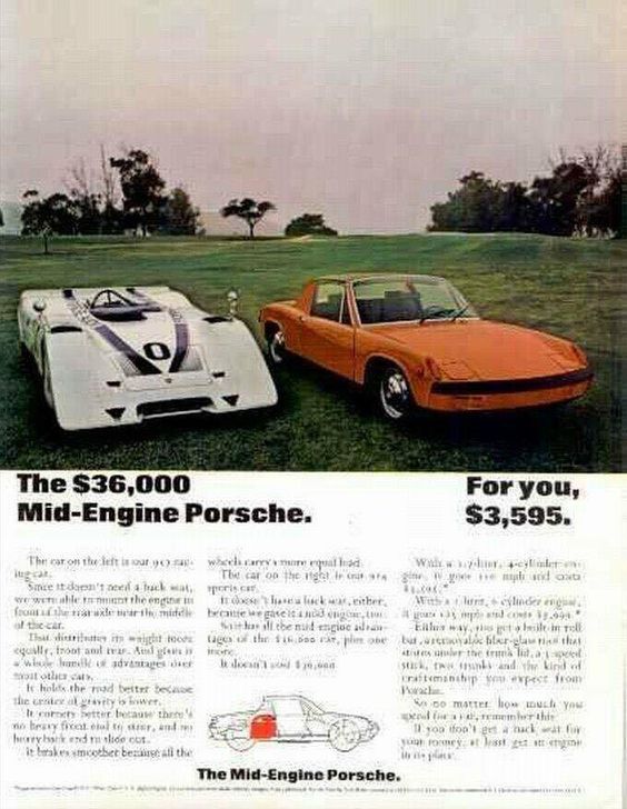
Not everyone could own one, of course, but the company was clearly more receptive toward broader customers at the time. The message implies that Porsche was building accessible vehicles for “regular folks.” Today, even the cheapest Porsche is still expensive enough that it remains an aspiration purchase for many.
Expert takeaway: Nostalgia sells. When an ad makes you feel you’re entering a club you can actually afford, it lowers the psychological barrier to purchase.
Theme 2: Humor Built on Names, Identity, and Absurdity
What Is A Gremlin’s Anatomy?
We mean this question seriously—not as a joke. We were not prepared for this ad. Has anyone ever seen “gremlin anatomy” in an anatomy book? If you have, please enlighten us. We’d love to know what a gremlin’s anatomy is supposed to look like in scientific terms.
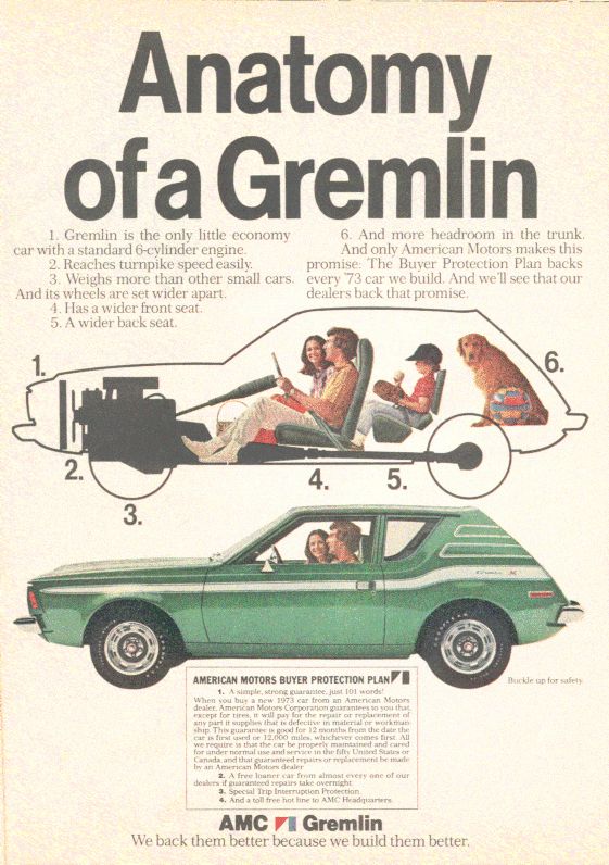
Good news: this is only the moniker of the vehicle. But the ad still lands because it creates an immediate mental image. A “Gremlin” sounds mischievous, compact, and a bit chaotic—which matches the visual vibe perfectly.
And yes, it looks compact. So compact that you might wonder whether a dog would feel comfortable sitting in it. Still, the ad insists it offers respectable technical specs, which is another vintage-ad trick: make you laugh first, then reassure you it’s still a “real car.”
Expert takeaway: A bold name can do half the marketing work. Once you remember the name, the car becomes memorable even if you never buy it.
Getting The Best For Your Buck
If you only saw the headline and the picture, you might assume you’re paying that price for two stacked cars—like a buy-one-get-one automotive deal. And honestly, the ad wants your brain to go there, because it makes you pause long enough to read the fine print.

The cleverness is that it really does claim “two vehicles in one.” Once you read the full ad, the logic becomes clearer and you understand what they mean by that promise. The best part is how confidently it’s delivered—no overexplaining, just a hook that forces curiosity.
If you study the copy, you’ll see why vintage print advertising worked: it rewarded attention. If you read carefully, you learned exactly what the offer was. And if you didn’t, you still remembered the picture—meaning the brand won either way.
Expert takeaway: “Value” ads succeed when they do two things at once: entertain the eye and justify the purchase logically.
A Car Humor With Dual Purpose
Compared to many other ads, this one is among the most amusing because it assumes the audience is clever enough to “catch” it. The manufacturer claims this is all the Japanese you need. The humor is strong, the layout is striking, and the concept is playful—though it’s admittedly not the easiest joke to spot immediately.
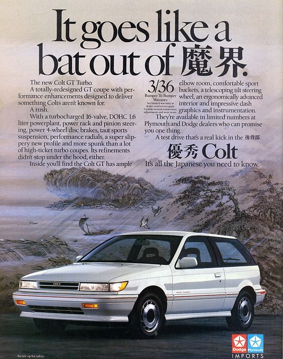
Like many of the best vintage ads, the humor is the hook, but the hook also pushes identity: it frames the product as sufficient, complete, and confidently “enough.” If you got the reference quickly, you’re exactly the kind of reader this ad was built for.
Expert takeaway: Dual-purpose humor is powerful because it creates a “smart reader” reward. If you understand it, you feel included—and inclusion is persuasive.
Jokes With Multiple Meanings
Sometimes brands recycle ads to save budget. Other times they reuse successful concepts because they know the joke works. Chrysler appears to be doing exactly that here: using the same humor structure to sell a different vehicle.
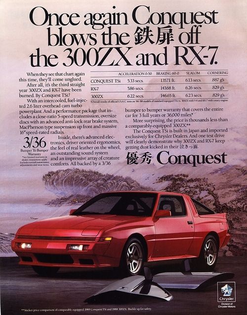
This one is easier to understand at first glance. The company replaces curse words with Japanese characters—so you can “swear” without swearing, at least in the viewer’s language. It’s cheeky, and it also suggests the car is so good it makes people emotional.
Expert takeaway: Repeatable ad templates are not lazy when they work. In print, consistent humor can become a recognizable brand signature.
Theme 3: Eco, Efficiency, and “We Care” Messages (Done with Style)
Environmental
This ad doesn’t look old—and neither does the vehicle. To be fair, it’s a fantastic promotion, because it communicates a modern value: the manufacturer is trying to reduce environmental harm compared to other brands.
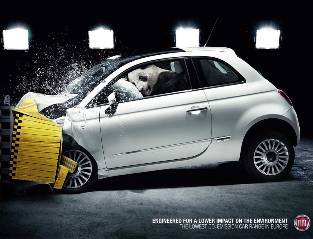
It claims Europe’s most efficient carbon dioxide emissions performance, which is a strong positioning statement. The collision test image leaves us baffled (and yes, we’re still confused), but the panda is doing most of the work here: it symbolizes gentleness, minimal footprint, and friendliness. More than anything else, the panda serves as a visual shorthand for “eco-conscious.”
This is imaginative marketing at its best: it makes the message memorable without requiring a wall of emissions data.
Expert takeaway: “Green” advertising is most persuasive when it feels emotionally simple. A strong symbol (like the panda) often outperforms technical charts.
The Advantage Of Mini Cars
Here’s another clever ad, built around a practical advantage rather than pure aesthetics: parking cost. That’s a painfully real expense in many cities, and small cars can save owners money in ways most buyers don’t calculate upfront.
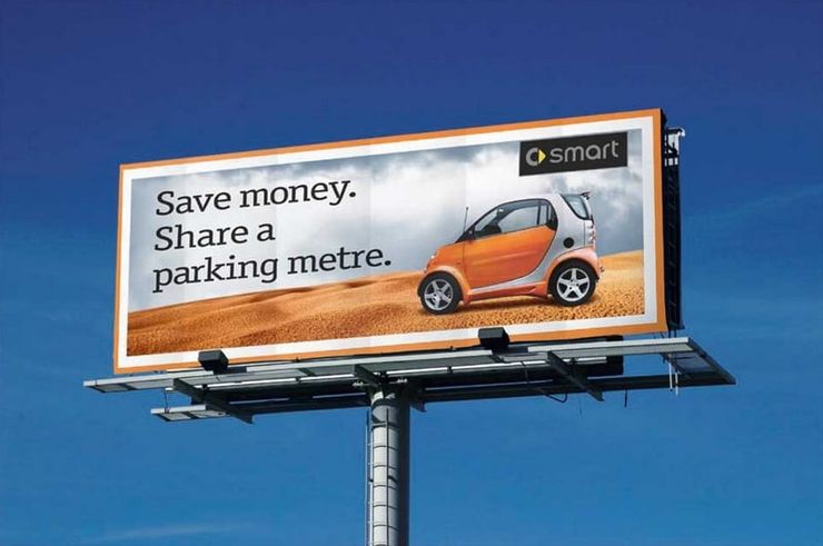
The SmartCar’s defining feature is its size, and the ad leans into that identity with confidence. The humor is subtle: it makes you think about your own budget habits and then suggests a tiny car can quietly win a financial battle you didn’t realize you were fighting.
We’ve also come to appreciate how consistently SmartCar and similar brands use creative marketing. The ad proves that “small” can be positioned as smart rather than weak—especially when the benefit is framed as long-term savings.
Expert takeaway: Practical humor sells because it feels like advice, not persuasion. If an ad makes you feel financially clever, you’re more likely to trust the brand.
Theme 4: Competitive Roasts, Rivalries, and the Art of “Dragging”
Modern brands are often careful with direct comparisons because of legal constraints and brand image risk. Vintage advertising—especially print and billboard wars—was sometimes more fearless. The result: some of the most entertaining “brand rival” moments in automotive history.
Bravery And Honor
This BMW ad is bold—so bold it probably added new names to BMW’s enemy list. The company placed its car next to seven other high-quality vehicles from equally respected manufacturers and made direct comparisons. That’s not subtle marketing—that’s open competition.
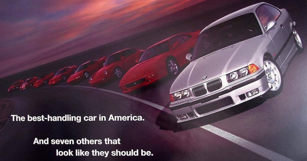
That kind of move is risky because it invites backlash. But it also signals confidence: “We belong in this group, and we’re not afraid to say it.” The amusement comes from the audacity—an ad that doesn’t just sell a car, but challenges the hierarchy in the buyer’s mind.
Expert takeaway: Competitive comparison works only when you can back it up. If the product doesn’t deliver, the ad becomes a future meme—against you.
Dragging The Competition
Car companies face a hard reality: it’s difficult to make a car that is truly unlike everything else. Many brands therefore compete through perceived value. This Citroën ad leans into that by pointing out that their new car offers features similar to famous cars that cost over ten times the price of their 2CV.
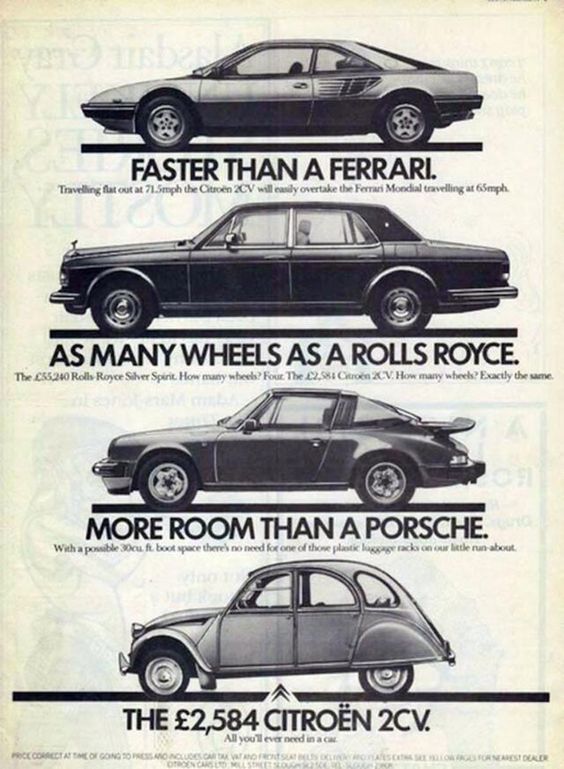
The punchline is simple: you’re paying for brand value elsewhere. Citroën claims to offer similar usefulness without the premium tax. It’s a clever form of “dragging” because it frames the competition as overpriced rather than superior.
Expert takeaway: Value-based competitive ads work best when they don’t insult the customer. This one aims its criticism at pricing logic, not at the buyer.
Drop The Mic!
Subaru’s ad here is a brutal retort—one of the most vicious comebacks in this collection. The logic is simple: awards matter, but some awards matter more than others. In movies, winning “Best Cinematography” is nice, but “Movie of the Year” is the big one.
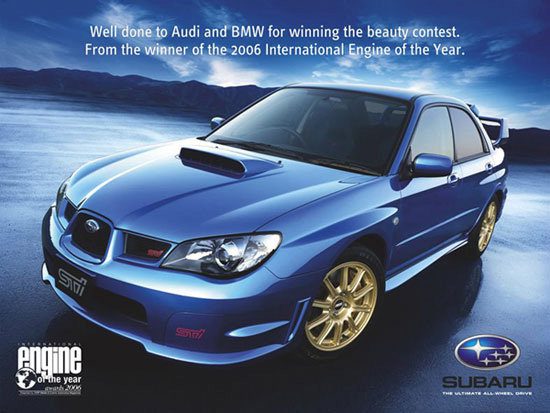
Subaru uses that analogy to argue that awards for performance—like best engine—carry more weight than awards for softer categories. The ad is funny because it’s not just bragging; it’s ranking the value of praise itself. And yes, Subaru didn’t have to drag competitors like this—but they did, and it works.
Expert takeaway: The best brand roasts are built on logic, not noise. Subaru’s point is structured like an argument, which makes it stick.
What About The Queen?
Competition inside the same niche is not a bad thing. It forces innovation, creates better products, and gives customers more choice. It also produces hilariously petty moments—like this billboard battle between BMW and Audi.

BMW posts a message. Audi responds with a bigger billboard that flips the meaning. BMW escalates with even larger wordplay. It’s advertising as chess—expensive, public chess. The comedy is in the escalation: the “billboard arms race” becomes a story people talk about, which is exactly what both brands want.
Expert takeaway: Rival ads work when they create a narrative the public follows. The ad becomes entertainment, and the brand gets attention without begging for it.
Audi Was Completely Committed
If this list proves anything, it’s that Audi takes advertising seriously. They don’t want “a simple ad.” They want attention—and they often earn it with confidence bordering on arrogance.

The message is essentially: if you’re not driving an Audi, stay in the right lane. It’s funny because it captures a real driving frustration—being stuck behind slow drivers on the freeway—then turns it into a badge of “performance identity.” It’s not polite, but it’s memorable.
Expert takeaway: Confidence sells, but it must match the product. If a brand uses aggressive tone without delivering performance, the ad becomes self-parody.
BMW Strikes Again
The media sells “true love” as romantic destiny, but BMW flips that idea into material obsession. The joke: if you wish upon a star, be specific—because your true love might not be a person. It might be the perfect car.

This ad works because it understands a certain audience: people who genuinely love driving and treat a car as an emotional object. It’s playful, slightly smug, and perfectly targeted at enthusiasts who would nod and say, “Honestly… fair.”
Expert takeaway: Lifestyle ads succeed when they reflect a truth about the buyer’s identity—even if the truth is ridiculous.
There’s No True Distinction
This ad claims a Lamborghini and a Volvo are identical. At first glance, the statement feels absurd—these cars don’t look alike and don’t deliver the same performance experience. So what does “identical” mean here?
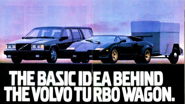
The ad forces you to think. Let’s pretend they’re equal. Which is your go-to option: a Volvo for the family, or a Lamborghini that can pull a trunk? There’s no right answer—because the question itself is the hook. Volvo earns points for daring to start a conversation it can’t “win” on speed, but can win on practicality and logic.
Expert takeaway: When you can’t compete on raw performance, compete on meaning. Volvo turns “comparison” into a debate about real-life priorities.
Theme 5: Safety PSAs (Not Selling Cars, Still Selling Attention)
Warning Drivers About Road Safety
This isn’t an ad for a vehicle; it’s a reminder. If you drive behind a truck, you must be extra careful and leave space. Trucks have longer stopping distances, and their undercarriage can turn a crash into something far worse than a typical collision.

This PSA doesn’t need many words. The image of a car with its roof ripped off and one sentence is enough to make drivers slow down. If a truck brakes suddenly, you could end up underneath it—and wind up with a “brand-new” convertible you never asked for.
Expert takeaway: The most effective safety ads are visual and immediate. They don’t argue—they show consequences.
Tailgating Ads Are The Most Creative
Public safety agencies regularly push anti-tailgating messages because the behavior is common and deadly. A simple error on a highway can cost a life, and many crashes are preventable with one habit: more following distance.
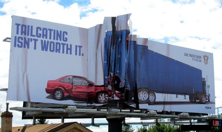
This ad makes the result visceral. Drive too close to trucks and you may end up with a folded-up vehicle like the one on the billboard. Even though tailgating is illegal and dangerous, rushed drivers forget safety. This ad doesn’t let you forget.
Expert takeaway: Effective PSAs target predictable behavior patterns: rushing, impatience, and false confidence.
Let There Be Harmony
Another public service announcement, and a useful one. Many people share roads with cyclists—whether because they can’t afford cars, prefer bikes, or are trying to reduce environmental impact. Regardless, cyclists are more vulnerable.
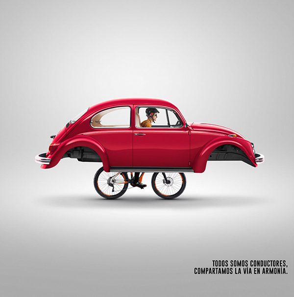
The message is simple: respect bikers and share the road. Everyone wants to reach their destination safely. When drivers treat cyclists like obstacles rather than people, accidents happen. Harmony isn’t a soft concept here—it’s a safety strategy.
Expert takeaway: The best road safety messaging frames respect as practical, not moral—because practicality changes behavior faster.
Theme 6: Ads That Wouldn’t Fly Today (But Were “Normal” Back Then)
Advertising Strategies That Didn’t Stand The Test Of Time
This kind of ad would not land well today. It’s unusual—and for its era, it was also clever. Advertising used to include messages and assumptions modern audiences reject, but it’s still interesting to see how the industry thought at the time.
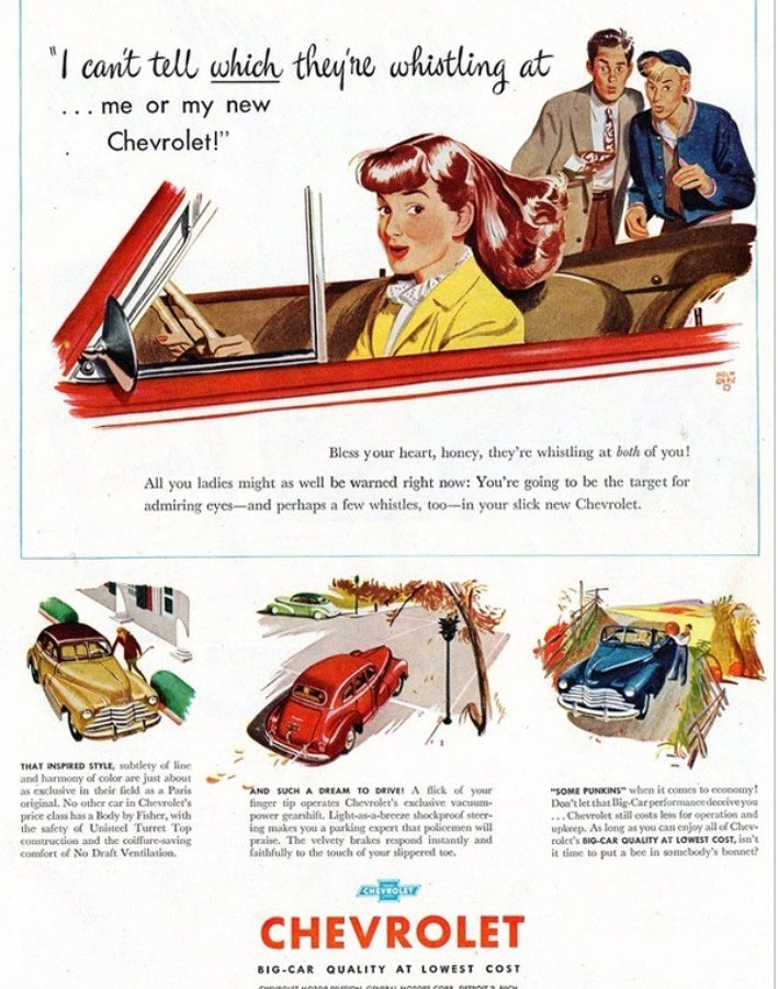
First: whistling at women is not flattering—don’t do it. But in the era this ad appeared, that behavior was treated casually. The ad’s angle is that the car is so attractive that the men ignore the woman entirely because they can’t stop looking at the car. It’s a time capsule of cultural norms more than a product pitch.
Expert takeaway: Advertising always reflects society. When society changes, old ads become historical documents—sometimes uncomfortable ones.
Theme 7: Classified Chaos & Accidental Comedy
Subtle Advertisement
This isn’t a manufacturer ad, but it deserves a spot because it’s hilarious. Harley-Davidson bikes are widely admired, often treated as top-tier motorcycles. But in this ad, the bike isn’t the main story—the seller’s personal life is.
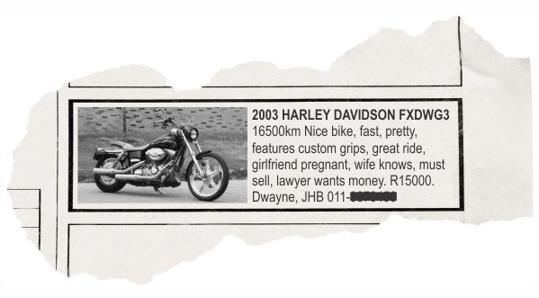
He’s in a bad situation. The bike is good, but he got his lover pregnant and his wife found out. He’s not selling because he wants to—it’s because his spouse’s lawyer wants the money. The ad becomes comedy because it’s too honest. It’s a reminder that sometimes the best “advertising” is just accidental storytelling.
Expert takeaway: Honesty is persuasive. Even when it’s messy, it feels real—so people pay attention.
A Haughty And Meaningless Commercial
When we first saw this, we genuinely wondered what the point was. Then we read it, and the reason we couldn’t stop giggling became obvious. Imagine shopping for a car and spending time reading this… only to learn it isn’t for sale.
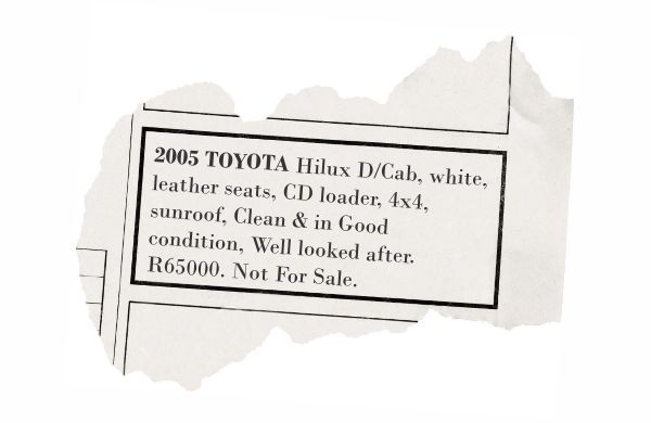
After describing the pristine condition, the writer clarifies it’s not for sale. That’s not really an ad—it’s bragging. And it’s especially funny because they’re bragging about an old car. But the humor works because it flips expectations: you read expecting a transaction, and instead you get a flex.
Expert takeaway: Expectation reversal is a classic comedy device—and it works in advertising because it forces attention.
There Is No Other Way
This ad captures desperation with surprising honesty. Sometimes people need transportation and can’t be picky. The saying fits: if you’re broke and you need a car, you might end up considering something like this.
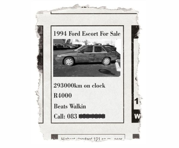
There are about 300,000 kilometers between its tires, it isn’t pretty, and it’s clearly not premium. But the seller is honest anyway. Even a bad car, they imply, is better than having to walk everywhere. It’s not glamorous—but it’s real.
Expert takeaway: Some ads aren’t selling aspiration; they’re selling survival. That honesty becomes the message.
Traveling Author
Some agencies build ads where the image is supposed to speak louder than words. That’s a smart strategy—unless, as critics joke, it’s simply an excuse for not having a copywriter available.
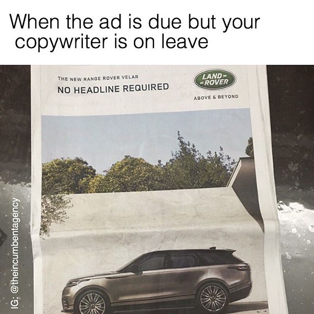
Is a Range Rover great? Technically, yes. It’s globally popular and doesn’t need introduction. But the question remains: what makes this model different from other Range Rovers? The ad leaves you wondering if the copywriter really was on leave—or if the brand assumed its reputation was enough to do the selling.
Expert takeaway: Brand power can reduce the need for explanation, but it can also create lazy advertising. The best brands still give people a reason to care right now.
Theme 8: Celebrity, Lifestyle, and Social Commentary (Old Ads Were Bolder)
A Car For All Heights
This ad features Wilt Chamberlain and an early Volkswagen Beetle. It succeeds because it’s sincere—and sincerity can be funny when it’s delivered with clean logic. The formula here is strong: truth + education + humor.
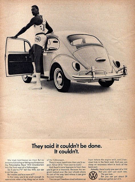
If you were Wilt’s height, people might assume you can’t fit in the car. The ad acknowledges that—and then uses humorous copy to guide the reader through the reality. It’s disarming because it anticipates the objection and addresses it like a conversation, not a pitch.
Expert takeaway: Great ads handle objections before the buyer can raise them. When the response is funny, it feels even more persuasive.
Relationships Are Tricky
Prenups don’t make sense for most people because most people don’t have massive wealth or ultra-valuable assets. But for the very wealthy, prenups are about protection. This ad uses that logic to make a brutal class statement.

Aston Martin isn’t trying to pretend it’s for everyone. The ad implies that if you own a Corolla, you don’t need to protect it in a divorce—but if you own a $300,000 Aston Martin, you absolutely do. It’s funny, elitist, and effective at reinforcing the brand’s luxury identity.
Expert takeaway: Luxury advertising often sells exclusivity by making the “not for everyone” message explicit. It’s risky, but it attracts the buyers who want that status signal.
Lies That Have The Sweetest Taste
No one here condones bank fraud—don’t do it. But this old ad is outrageous enough that it still makes people stop and laugh. It’s basically offering a “creative strategy” to convince bankers that the car is a sensible expense.
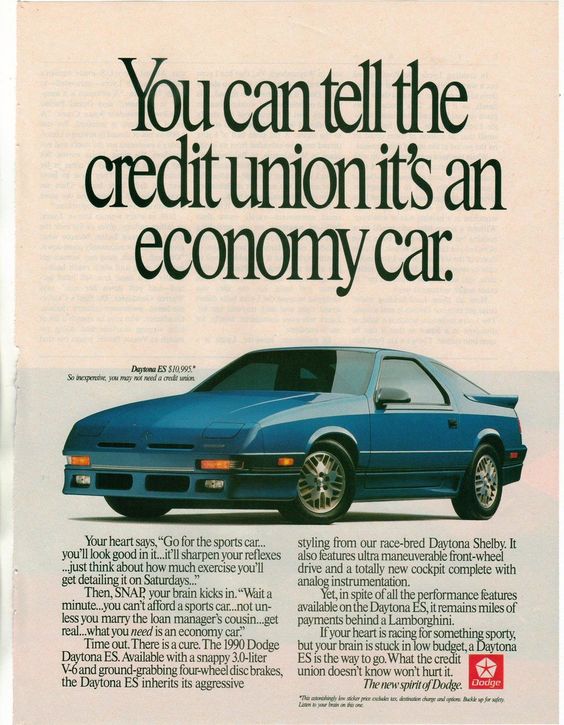
The ad suggests you can pitch the car as economical for books and paperwork—reasonable, right? Except the vehicle shown is a Daytona Shelby, a track-bred machine that practically screams performance. “Look at that baby.” The humor is the contrast: the idea of justifying a racing icon as a practical office tool.
Expert takeaway: Contrast is comedy. Put a performance car in a “boring” context and the absurdity becomes the message.
Theme 9: Ads That Sell Features Through Story (Sunroofs, Space, and Surprise)
Recreating Famous Scenes
This Fiat ad channels the iconic Titanic scene perfectly. The humor is immediate: no, the car can’t navigate the sea—but it can give you enough space and openness to feel like you’re in a movie moment.

The purpose is simple: the ad highlights that the car’s sunroof was the largest on the market at the time. If two people can recreate a cinematic pose through your roof opening, the feature is memorable. We do wonder who drives in this scenario—but that question is part of why the ad sticks.
Expert takeaway: Feature ads work best when they show lifestyle value. “Biggest sunroof” becomes more compelling when it’s tied to an emotional scene.
Jokes With A Sinister Twist
Most classic ads focus on technical details. This one takes a darker route: it sells the car by highlighting a hidden space—then jokingly suggests it’s useful if you need to hide something from the police.
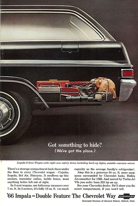
Yes, it’s gloomy. But it’s also memorable because it uses shock humor to highlight storage. And to be fair, you can store normal items there. The ad simply chooses the most dramatic “example,” because drama is attention.
Expert takeaway: Risky humor grabs attention fast—but brands must be careful, because not every audience tolerates “dark” messaging.
Theme 10: “We Can’t Believe This Worked” (But It Did)
That Car Is Not Fit For The Job
This was Volkswagen’s attempt to convince police departments to use their cars. The problem is that Volkswagen had many models to choose from—so why pick a Beetle? More doors would help. More space would help. And yet… the Beetle was the pitch.

What makes it funnier is that police in an Alabama city (and in many European cities) actually used Beetles. We’re genuinely curious how criminals were transported in these cars. They aren’t exactly roomy. But the ad proves something powerful: if the car is reliable and recognizable, even an unlikely “police car” pitch can land.
Expert takeaway: Sometimes the “wrong” car works because it offers operational advantages (simplicity, reliability, cost) that outweigh image concerns.
Like Father, Like Son
This may be Volkswagen’s finest wordplay. The Beetle was popular, so different versions made sense. But this ad stands out because the language is precise and layered.
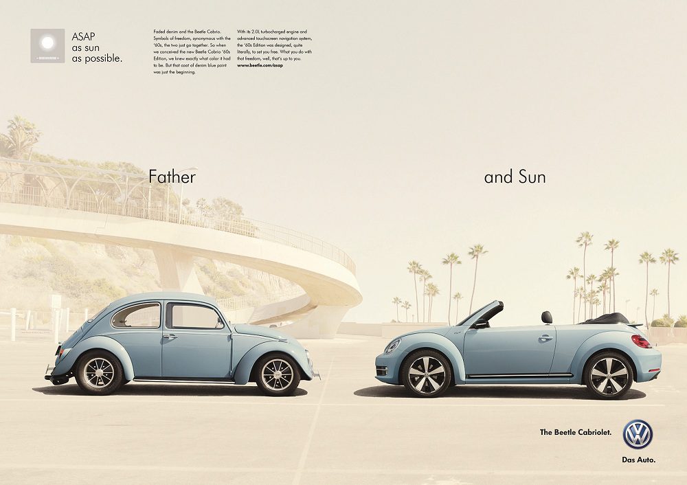
It uses ASAP as “as sun as possible,” then calls the roofless Beetle Cabriolet the “Sun” rather than the “Son.” It’s clever, clean, and exactly the kind of ad that makes you respect the copywriter’s brain. It sells the convertible feature while keeping the tone light.
Expert takeaway: Wordplay works when it’s simple enough to catch quickly and smart enough to reward attention. This ad nails both.
Theme 11: One-Image Ads (When the Picture Does All the Work)
The Lightest Bike
If you want to build a reputation in marketing, you need standout creativity. There are millions of marketers competing for attention, and the simplest ideas are often the hardest to execute well. This ad is a clean example of that.

There are no words. None. And yet you instantly understand the message: the bike is light. Wordless ads can be extremely effective when the visual metaphor is strong enough. This is a perfect illustration of “show, don’t tell” marketing.
Expert takeaway: If your image communicates the benefit instantly, words become optional. That’s rare, and that’s why this ad stands out.
Theme 12: “Size” Messaging, Double Meanings, and the Compact Car Flex
Size Doesn’t Matter
Going through vintage ads, this is one of the nastiest double-entendre examples. The Mini has always been a beloved compact car, but tiny automobiles aren’t popular with everyone—especially people who equate size with status.
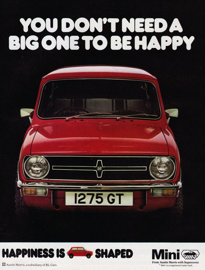
The ad’s message is: small can still be great, provided it has quality. And yes, we refuse to unpack the full double meaning here. But the reason the ad works is simple—it challenges insecurity with humor, and it frames compactness as confidence rather than compromise.
Expert takeaway: Humor can neutralize insecurity. If an ad makes the buyer laugh at the stereotype, the stereotype loses power.
Tiny But Mighty
Volkswagen’s Polo ads often highlight sturdiness. German manufacturers have a reputation for quality, and this ad leans into that by turning “small” into “protective.”

The tagline is “small but tough,” and the visual proves it by showing a dozen cops squeezed together behind the small frame during a standoff. Even though it’s a still photo, you can feel the drama. The joke is that the tiny car is so sturdy it becomes a shield.
Expert takeaway: The best “toughness” ads don’t say “tough.” They show a scenario where toughness matters.
Theme 13: Humor About Real-World Driving (Slow Drivers, Police, and Everyday Frustrations)
How To Escape This Car?
Germany is home to many famous performance brands—Audi, BMW, Porsche—so it makes sense that law enforcement there would drive capable vehicles too. This ad leans into that reality with a simple point: if the police have a Porsche, escaping is unlikely.
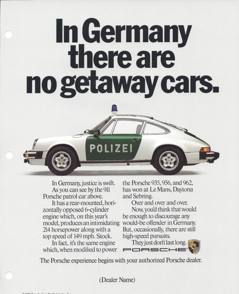
Porsche is German, and the ad implies police vehicles there are manufactured by this brand. Since Porsche cars are fast, the odds of escaping in a pursuit are slim—unless your Porsche is somehow better than theirs. It’s playful, arrogant, and aimed at enthusiasts who find that idea entertaining.
Expert takeaway: The ad uses a fantasy scenario (outrunning police) to sell speed. It’s not literal—it’s emotional positioning.
But Can Other People Drive It?
Young drivers tend to rush. Older drivers tend to prioritize comfort and calm. That stereotype isn’t always fair, but it’s common enough that advertisers love using it—especially when they want to encourage a “faster, more confident” identity.
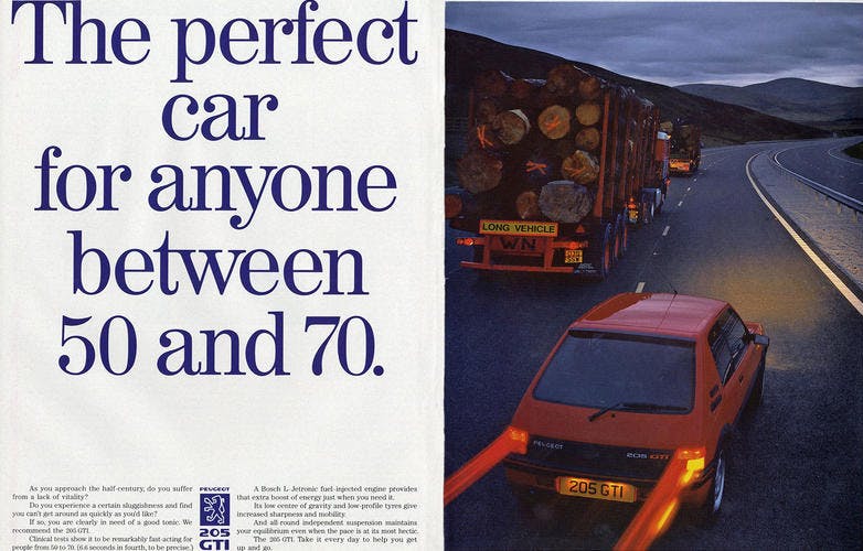
Peugeot used that idea here by targeting older drivers with a car that’s “fast for its category,” implying it could nudge them toward driving a bit quicker. The joke is sharp: even long trucks are moving faster than them. It’s a gentle insult designed to motivate.
Expert takeaway: Ads often sell identity change: “You are this kind of driver now.” Humor makes that message less offensive and more persuasive.
Audi Was Completely Committed
Theme 14: Confusing Offers, Split Personalities, and Multi-Model Mischief
Show Off Anywhere
Dodge plays with the market by making it look like two distinct models are being offered—when they’re really just different versions of the same car. The copy is confident, almost smug, as if the advertiser knows you’ll want both.
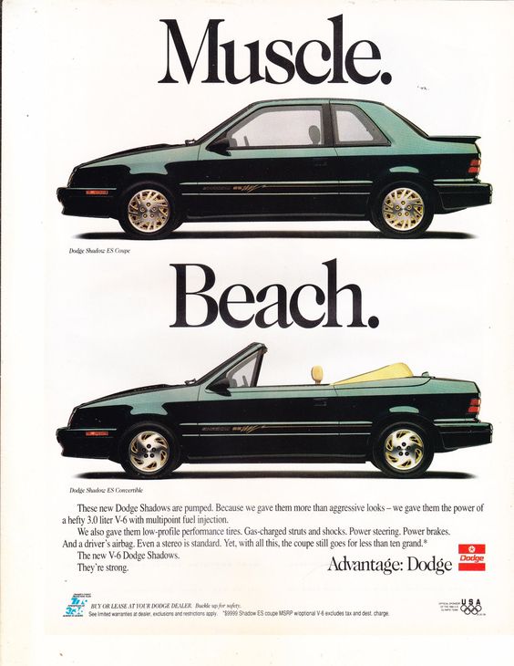
There’s a “beach look” for seaside vibes and a “muscular look” for showing off with friends. But what if you want both lifestyles? According to the logic of this ad, you should buy both versions. It’s funny because it’s absurdly honest about consumer desire: one car isn’t enough for every identity you want to perform.
Expert takeaway: Lifestyle segmentation is old. Brands have always sold “versions of you,” not just versions of the car.
What Could Be Of A Better Value?
The Dodge Daytona was a huge success, so it makes sense the manufacturer released multiple versions. The car wasn’t only popular for looks—it also sold because it was seen as affordable for what you got.
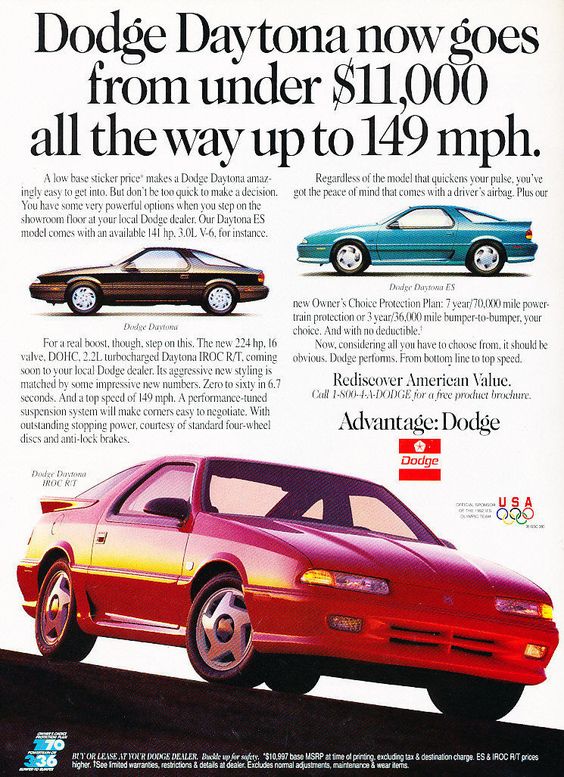
Different versions for different drivers is a smart strategy. Add in claimed top speeds up to 149 miles per hour and the value story becomes even stronger. The ad’s job is to make buyers feel like they’re getting a deal—not just buying a car.
Expert takeaway: “Value” isn’t only price—it’s perceived performance per dollar. That’s what this ad is selling.
A Sports Car Or Not?
You can call it a sports car if you want. But the ad wants you to reconsider—because according to the company’s representatives, the Ibishu Covet ZXi was never intended to be a sports vehicle.
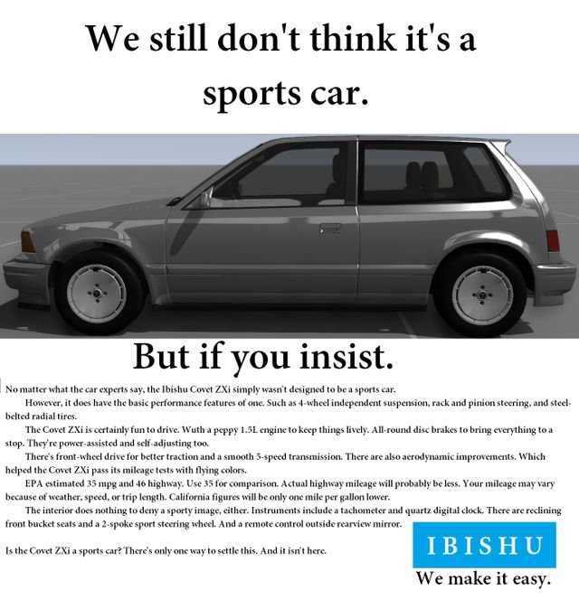
And yet, it comes equipped with what you’d expect from a sporty machine, including basic performance specifications. The exterior design argues “utility,” but that’s the selling point: you get to drive a practical-looking car with the potency of a sports one. That contradiction is the hook.
Expert takeaway: One of the oldest advertising tricks is selling the “secret performance” identity—power that doesn’t look like power.
Loose Ends, Bonus Laughs, and the Ones That Just Make Us Stare
Before Computers, There Was…
Final expert note: If you’re wondering why these ads feel more memorable than many modern commercials, it’s because they were built to be read, not skimmed. They assume attention. They reward curiosity. And they often treat the audience as intelligent enough to catch a joke without being hand-held. That approach isn’t “better” in every context, but it’s undeniably effective when executed well.
Wrapping Up: What Vintage Car Ads Still Teach Modern Marketers
Vintage car advertisements are entertaining, but they’re also educational. They reveal how brands positioned performance, safety, affordability, luxury, and identity—often with humor sharp enough to survive decades. Whether it’s Volkswagen’s wordplay, BMW and Audi’s billboard rivalry, Porsche’s price shock, or a public safety PSA that makes your stomach drop, the common thread is craft.
These ads prove that great marketing doesn’t require perfect technology. It requires a strong idea, a clear message, and the courage to deliver it in a memorable way. And if an ad can make you laugh and teach you something at the same time, it’s doing exactly what the best advertising has always done.