Advertising has always lived in a simple, unforgiving economy: attention is scarce, and indifference is expensive. You can spend a fortune placing an ad in the “right” location and still end up with a message that people glide past as if it were part of the scenery. Or, with the same placement and a smarter creative approach, you can build a piece of communication that stops people mid-step, earns a second glance from drivers (safely, one hopes), and sticks in the mind long after the commute is over.
Billboards sit at the intersection of psychology, design, engineering, and timing. They are public, unavoidable, and ruthlessly brief. Unlike a social ad that can be clicked away or a video that can be skipped, a billboard has one job: deliver a message quickly enough that a person moving through space can understand it, feel it, and remember it. It is not merely “big print.” It is the art of clarity under pressure.
From an expert perspective, the best outdoor ads tend to share a few strategic traits:
- They respect real viewing conditions. People see billboards while walking, waiting, driving, or daydreaming. The message must land in seconds.
- They make the environment part of the idea. The pole, the building edge, the sky, shadows, or even a nearby trash bin can become the punchline.
- They use contrast—visual or conceptual. A surprising material, an illusion, an unexpected scale change, or a clever twist on a familiar object creates instant curiosity.
- They deliver one clear takeaway. Not five features, not a paragraph—one message a brain can keep.
- They earn memory, not just visibility. A billboard can be “seen” and still forgotten. The goal is recall, not exposure.
The 45 examples below are strong because they understand those rules—and then bend them creatively. If you’re planning an outdoor campaign (or simply studying what makes advertising effective), treat this as a practical field guide. I’ll explain what each execution communicates and why the idea works in the real world, not just in a design presentation.
Note: Image credits remain in the captions for context. All promotional hyperlinks have been omitted.
45 Billboard Campaigns You Can’t Help Looking At (And What They Teach)
1. Visualizing a Headache as a Physical Impact (Tylenol)
People describe headaches with blunt metaphors: “pounding,” “hammering,” “like something is crushing my skull.” This billboard turns that language into a visual you can understand instantly. Instead of relying on clinical claims or tiny dosage text, it dramatizes pain as a force—an unmistakable “hit” to the head.
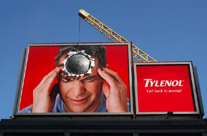
From a strategy standpoint, this works because it mirrors the audience’s inner experience. It doesn’t lecture you about ingredients; it says, “We understand what you’re going through.” That emotional accuracy is a shortcut to brand trust. The lesson is simple: if your product solves a feeling (pain, stress, fatigue), show the feeling—not just the product.
2. When Pain Looks Serious (Paralen)
Humor can be powerful, but there are moments when an ad wins by refusing to be cute. This headache-medication billboard uses a stern, tense expression to communicate what most headache sufferers already know: pain can make you withdrawn, impatient, and unable to “perform normal.”
It’s memorable because it’s honest. The creative doesn’t pretend headaches are mild inconveniences; it frames them as mood-altering disruptions. Outdoor advertising often fails when it tries to say too much. Here, one face and one idea do the work. The expert takeaway: strong billboards are frequently built around one human truth, not a long list of benefits.
3. Flossing as a “Lightbulb Moment” (Colgate)
Most people don’t avoid flossing because they dislike toothpaste brands—they avoid it because it feels optional, easy to skip, and invisible in the short term. This billboard makes oral care feel immediate by turning the toothpaste tube into a light source, visually “revealing” what brighter teeth could look like.
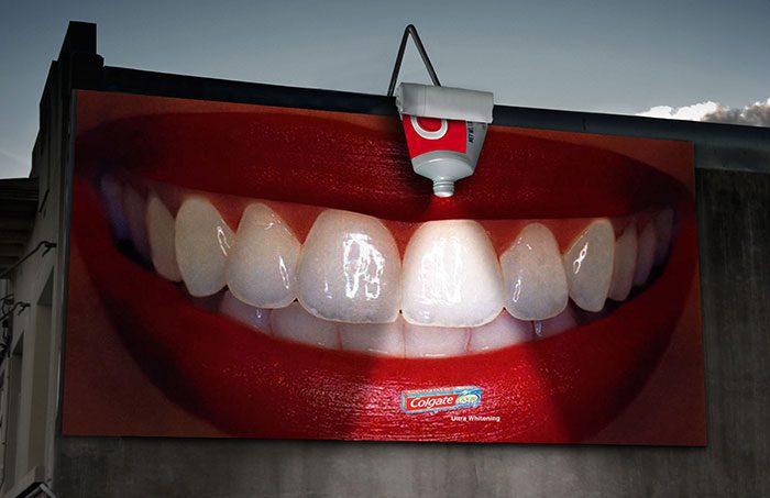
The brilliance is in the metaphor: cleanliness becomes illumination. On the street, it reads quickly. In memory, it reads longer—because it makes you imagine your own smile. If you’re marketing a habit-based product, borrow this principle: don’t just tell people to do the habit; show the transformation in a way the brain can “feel” immediately.
4. Wires Disguised as Nose Hair (Panasonic)
Outdoor placements often involve structural compromises: cables, supports, frames, and utility lines can interfere with the visual. This campaign turns that inconvenience into the central joke by making dangling lines look like wild, unmanaged nose hair—then presenting the solution: a trimmer.
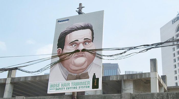
It’s slightly gross, undeniably effective, and impossible to ignore. In professional terms, this is “site-specific creativity” at its best: the environment becomes the message. The takeaway for brands is not to fear imperfections in the placement. Sometimes the odd constraint (a pole, a corner, a seam) can become the most memorable part of the idea.
5. Clean Pores, Presented as a Literal Cleaning Job (Pond’s)
Skincare is tricky to advertise outdoors because results are typically subtle, gradual, and hard to prove in a single glance. This billboard solves that by dramatizing a metaphor: pores as “spaces” that can be scrubbed clean. The visual suggests deep cleaning so intense it requires a worker on site.
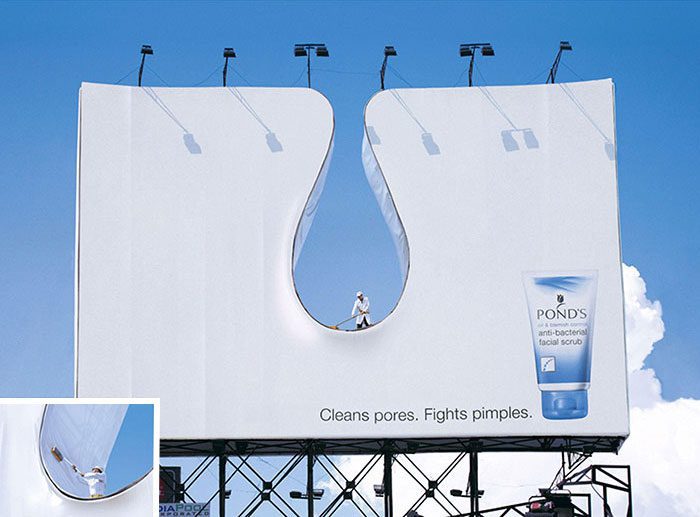
Even if the viewer debates whether a real person was hired, the ad has already succeeded: it triggered curiosity and conversation. That’s an underrated outcome in outdoor—talk is amplification. Expert lesson: when product results are intangible, convert the benefit into a tangible action the audience can visualize instantly.
6. Seat Belts as the Real “Safety Feature” (Mini)
Automotive safety claims can feel abstract, especially when every brand promises protection. This billboard communicates “safe” using a simple, universally understood cue: the seat belt. It’s a reminder wrapped inside a brand message—effectively letting the ad do public service work while still selling a car.
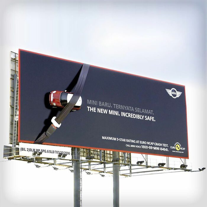
Is it a physics lecture on crash dynamics? No, and it doesn’t need to be. Outdoor messaging must prioritize comprehension over nuance. The key lesson: if your brand wants to claim “safety,” anchor the claim to a behavior people can perform immediately—buckling up is action, not theory.
7. “Waste Not” Executed With Minimal Ink (Denver Water)
Conservation messaging often fails because it’s delivered with too much… well, everything. Too many words, too many images, too much moralizing. This billboard is intentionally sparse, using only what is necessary—aligning form with message. In other words, the ad demonstrates conservation while talking about it.
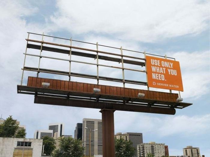
From an expert lens, this is behavioral design: it nudges rather than scolds. And because it’s visually unusual, it earns attention without noise. The marketing takeaway: when your message is “use less,” the smartest creative choice is often to literally use less.
8. Recycling, Built Into the Wayfinding (Coca-Cola)
This billboard does something many campaigns claim they want to do: it helps the public while promoting the brand. The execution points people toward a recycling bin, effectively turning a brand impression into a practical instruction. That usefulness is what makes it stick.
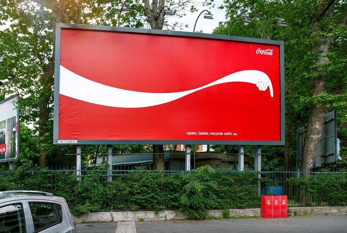
The deeper lesson is about alignment. If your product generates packaging, the public expects you to participate in the solution. This billboard meets that expectation in a simple way. Expert tip: if your brand can “earn” credibility by making a helpful action easier, outdoor is an excellent place to do it.
9. A Billboard Powered by the Sun (SunChips)
Sustainability claims can feel vague unless the brand proves commitment through behavior. This placement uses sunlight as part of the concept, linking the product’s green-energy narrative to a physical experience in the real world. The ad doesn’t just say “solar”—it behaves as though it belongs to the sun.
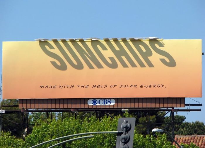
When environmental messaging becomes experiential, it becomes believable. The professional takeaway is to treat sustainability not as a slogan, but as a design constraint: your materials, energy use, and placement logic should embody the promise you’re making.
10. A Bee Hotel Disguised as an Ad (McDonald’s)
It’s difficult to ignore a billboard that doubles as habitat. This execution promotes a brand while supporting pollinators—an unusual combination that immediately creates conversation. Whether you love or criticize the company, you can’t pretend the idea is forgettable.
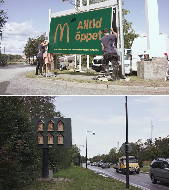
From an expert standpoint, the genius is “earned media by design.” People share what surprises them, and a brand-funded bee hotel is surprising. The strategic lesson: if you can build real-world utility into your campaign—especially utility that benefits a wider ecosystem—you multiply the impact beyond paid impressions.
11. Organic Billboards That Return to Nature (Toyota Prius)
Eco-friendly vehicles often rely on eco-friendly language. This campaign pushes further by making the billboard itself feel natural, temporary, and low-impact. The message becomes: “We’re not only selling a greener product—we’re communicating in a greener way.”
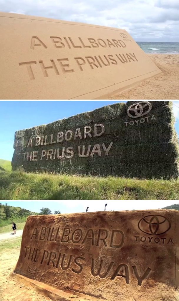
In outdoor media, production choices matter. Audiences may not know the exact materials used, but they can sense authenticity when the execution looks consistent with the claim. Expert advice: if your product is positioned as “clean,” “green,” or “minimal,” your campaign should look and behave that way too—otherwise you risk skepticism.
12. Protecting Species With a Not-So-Cuddly Animal (Animal Planet)
Many conservation ads default to charismatic wildlife—pandas, dolphins, baby seals—because they’re easy to love. This billboard chooses a snake, which is exactly why it succeeds. Fear is attention. Surprise is attention. And once attention is captured, the message can land.
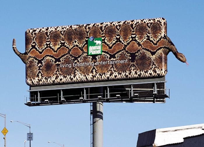
The expert lesson here is about creative risk: the safest idea is often the least effective. If your campaign aims to shift perspective—“even misunderstood animals deserve protection”—then a controversial animal is not a liability; it’s the point.
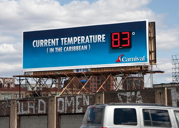
13. A Thermometer Billboard That Sells a Cold Drink (Coca-Cola)
Outdoor ads can do more than broadcast. They can serve as signals. In this case, the billboard communicates the temperature while making the audience crave a cold beverage—especially in hot weather when thirst is already present.
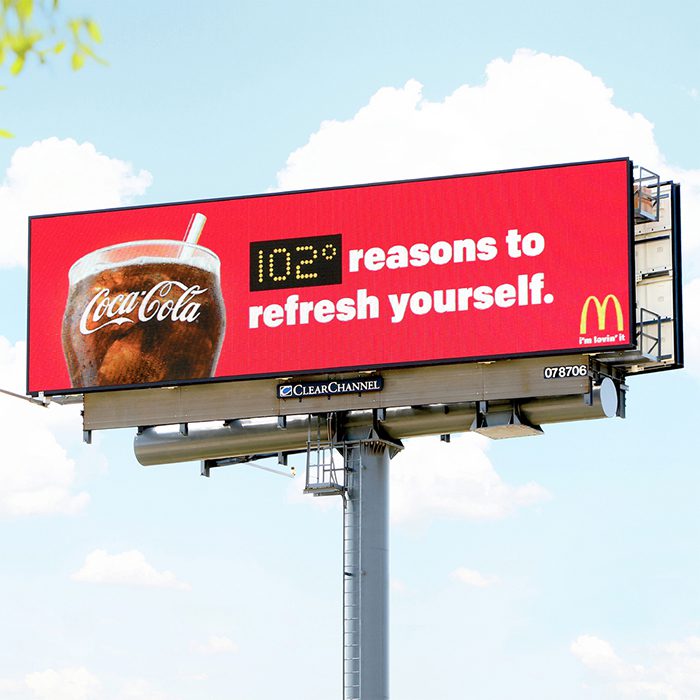
From a professional viewpoint, this is timing-based relevance. The message becomes stronger as the heat rises. That’s a powerful concept for outdoor: let real-world conditions amplify your creative. The takeaway: whenever possible, tie your ad’s impact to something the audience is already feeling in the moment.
14. A Sauce Billboard That Looks Like a Heat Warning (Capsico)
Spicy-food marketing is all about sensory imagination. You can’t taste a billboard, but you can trigger taste memory by implying heat, intensity, and consequence. This ad design leans into the idea that the sauce is almost dangerously hot—an invitation for spice lovers and a caution for everyone else.
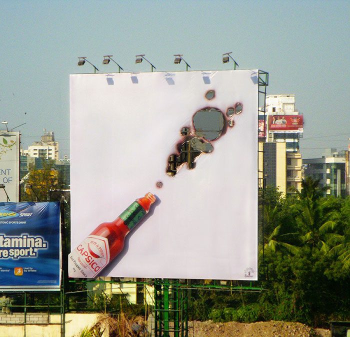
The expert move is that it doesn’t try to be subtle. It promises a clear experience: heat. Outdoor advertising rewards boldness because subtlety can disappear at speed. Lesson: if your product is defined by a strong sensory attribute (spice, cold, crunch), express that attribute in a single, unmistakable visual cue.
15. A “Break” So Literal It Looks Unfinished (KitKat)
The most effective outdoor ideas often operate like a visual prank: you think you’re seeing a mistake, then you realize the “mistake” is the message. This KitKat billboard appears to be a work in progress—complete with ladder—until you connect it to the brand’s iconic promise about taking a break.

From an expert standpoint, this is an attention hack done ethically: it interrupts expectation without creating danger. The “unfinished” aesthetic buys a second look, and the second look buys comprehension. Takeaway: design for double-take moments—when the brain must reprocess what it’s seeing, recall increases dramatically.
16. Cows as Brand Advocates (Chick-fil-A)
Characters can become long-term brand assets when they are consistent, distinctive, and slightly ridiculous. These cows are exactly that: earnest, persuasive, and humorously imperfect. The 3D build adds physical presence, turning the billboard into a mini spectacle rather than a flat poster.
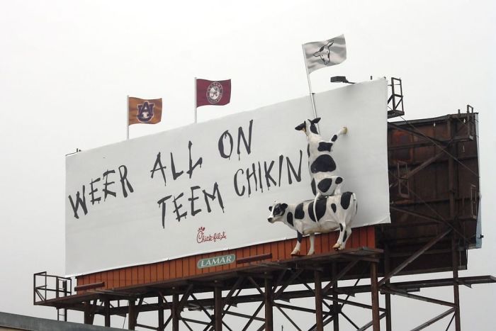
The strategic advantage is repetition with entertainment. People don’t mind seeing the campaign again because it’s playful. Expert lesson: if you can create a recognizable “cast” for your brand, billboards become chapters in a story instead of isolated sales messages.
17. Freshness You Can Practically Time (Bojangles)
“Fresh” is one of the most overused words in food marketing. This billboard makes freshness measurable by stating a production interval—made from scratch, refreshed frequently—so the claim feels concrete, not fluffy.
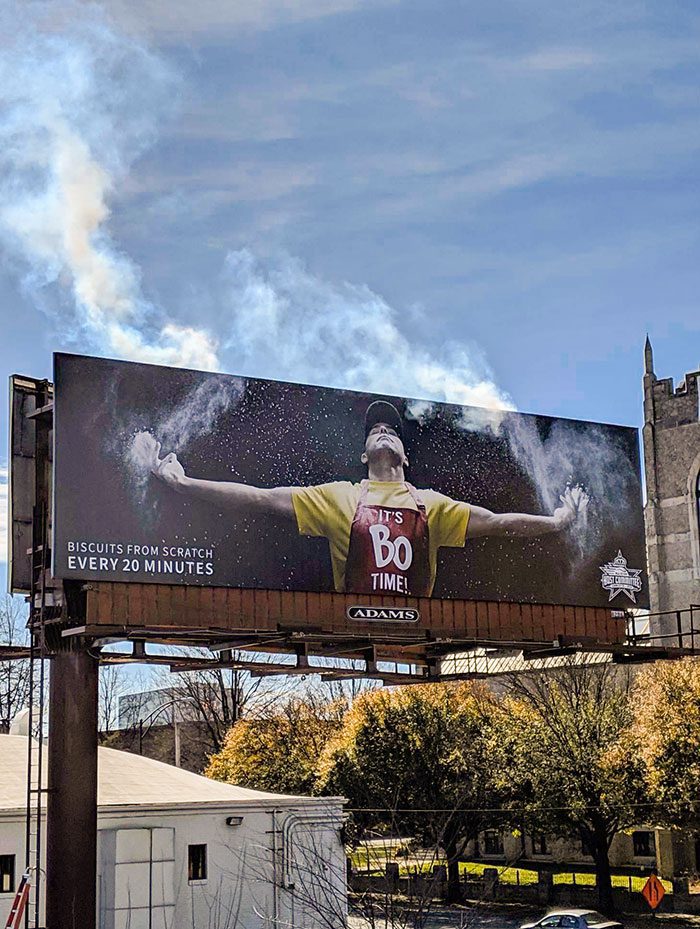
Expert takeaway: specificity is credibility. When your claim is common, you need evidence-like language (time, process, origin) to separate yourself from every other brand making the same promise. Outdoor is ideal for one strong, specific proof point—especially one that a hungry commuter can remember.
18. A Subtle “Turn Here” Without Looking Like an Exit Sign (McDonald’s)
Some of the smartest outdoor ads are basically friendly directions disguised as branding. This McDonald’s execution uses brand shapes and minimal graphics to hint at where the nearest restaurant is—fast to read, hard to misinterpret, and not cluttered with unnecessary copy.
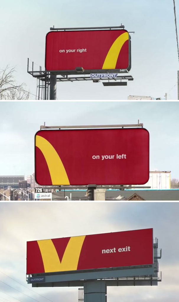
From a professional view, this is “friction reduction.” If the ad makes it easier to act, conversion improves. The lesson: when your product is immediate (food, fuel, convenience), don’t just build awareness—build confident navigation.
19. A Car That “Fits” More Than Expected (Honda Fit)
It’s hard to communicate interior space on a single billboard because you can’t invite people inside the vehicle. This ad solves the problem with a simple exaggeration: the car appears capable of holding far more than you’d assume from its size. The visual is playful, but the message is practical.
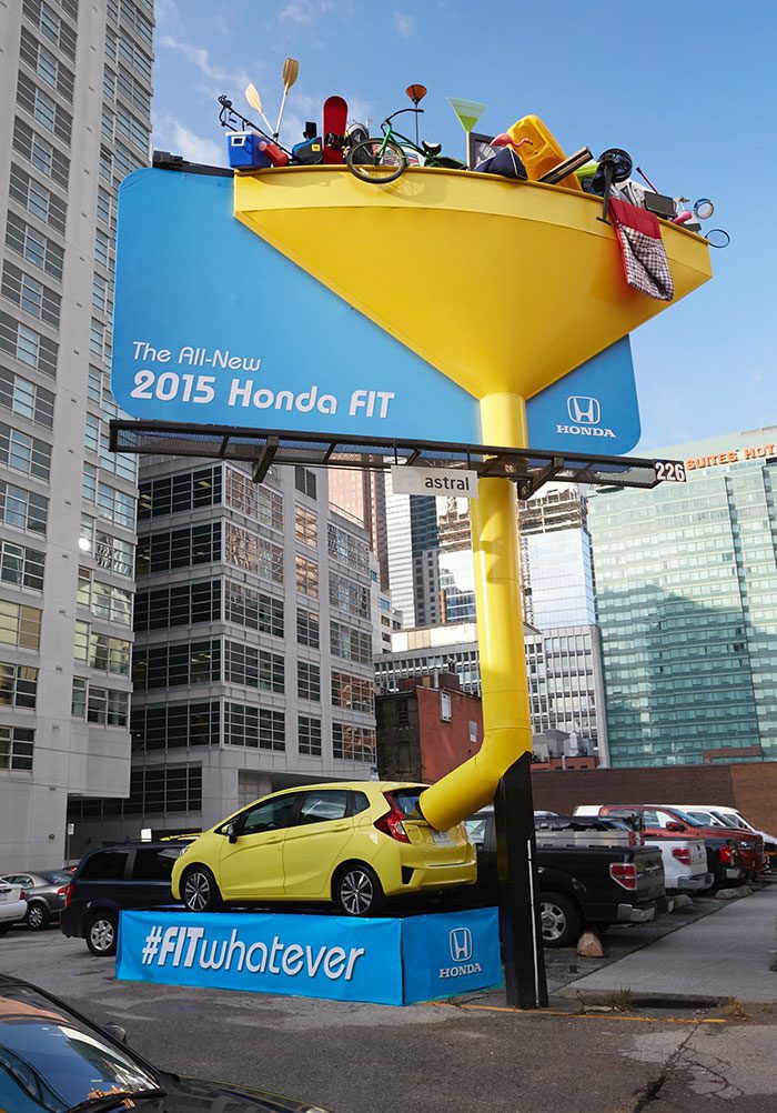
Expert lesson: when your product benefit is a “surprise” (more capacity, more power, more durability), the ad should recreate that surprise. Make the audience feel the “wait—really?” moment the same way they would in a test drive.
20. Toughness Demonstrated by a “Crash” Through the Billboard (Volkswagen Polo)
Durability is often communicated with generic imagery: rugged landscapes, aggressive typography, dramatic lighting. This billboard chooses a physical stunt: a telegraph pole appears to have slammed through the structure, and the message implies the car can handle it—without panic, without fragility.
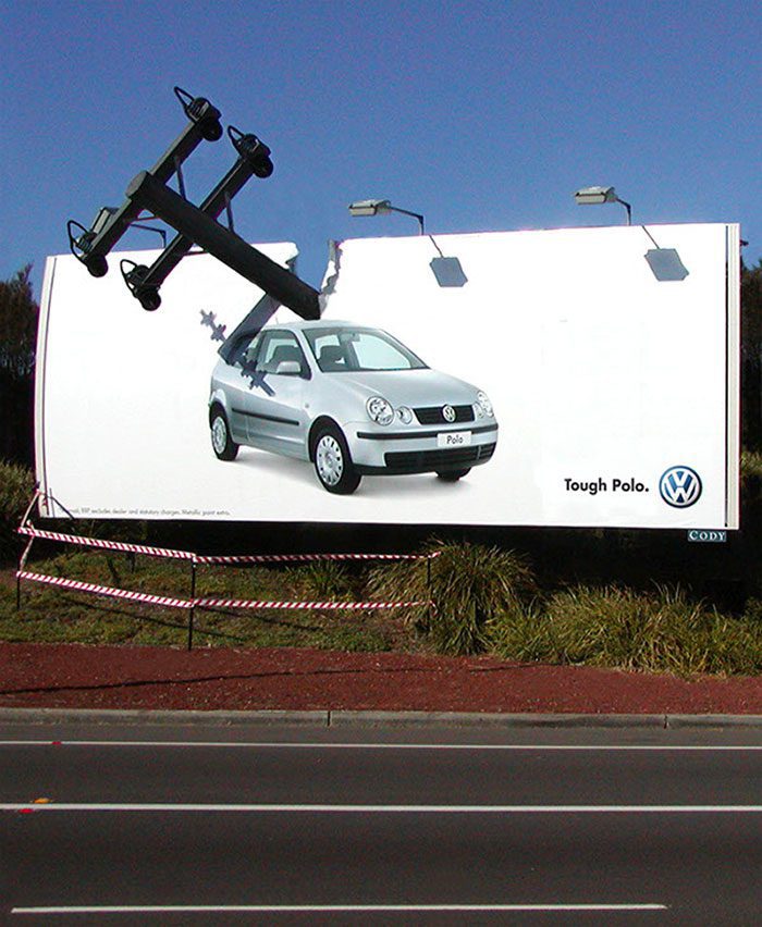
The expert insight is that “proof” beats “promise.” Even if the viewer knows it’s staged, the physicality sells the concept. Takeaway: when you claim resilience, consider making the media itself undergo a “test” so the message feels demonstrated, not merely stated.
21. A Billboard Held Together by Tape (3M)
Product demonstration is the oldest advertising tactic—and it remains effective when executed with imagination. This billboard makes tape feel heroic, as if the entire structure depends on a single strip’s strength. That turns a small, everyday product into the star of an oversized situation.
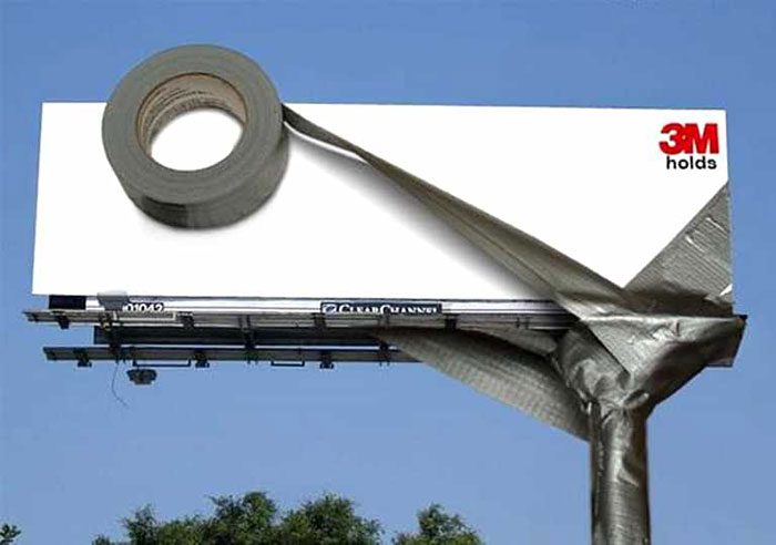
Expert takeaway: if your product is typically “invisible” (tape, glue, fasteners, cleaners), advertising should dramatize what happens when it works—or when it fails. Outdoor media is perfect for that because the viewer can instantly understand scale and consequence.
22. Taking “Think Outside the Box” Literally (Mini)
Clichés are dangerous in advertising—unless you turn the cliché into a visual twist that feels fresh. This billboard plays with the phrase “think outside the box” and transforms it into a literal, physical design moment that fits Mini’s brand identity: compact, clever, urban-friendly.
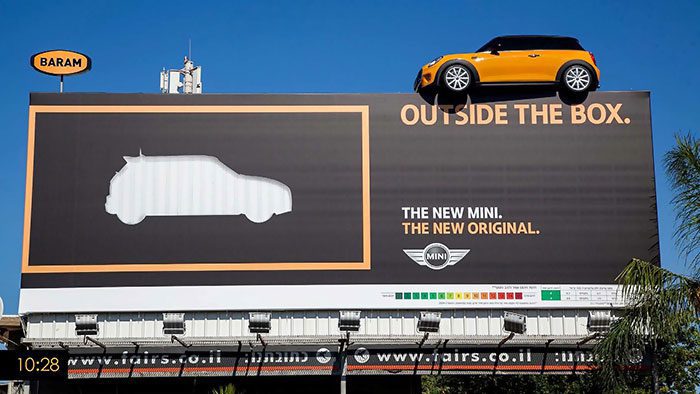
The professional lesson: you can use familiar language if you repay the audience with an unexpected interpretation. Outdoor viewers don’t have time for complex copy, but they do have time for a visual pun that resolves in one second.
23. Cooling Services Advertised as a Giant Popsicle (United Cooling)
A cooling company doesn’t sell popsicles, yet the popsicle is one of the fastest symbols for “relief from heat.” This billboard leverages that association immediately. You don’t need to read a headline to understand the promise; the image does the translation for you.
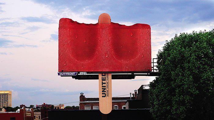
Expert takeaway: when your service is technical (HVAC, repairs, infrastructure), consider advertising with emotional shorthand—comfort, relief, calm—so the audience instantly connects the service to a felt benefit.
24. Making Moving Look As Hard As It Feels (Oversized Boxes)
Anyone who has moved homes understands the chaos: endless boxes, awkward lifting, time pressure, and the feeling that your life is temporarily packed into cardboard. This billboard makes that emotional reality physical by attaching large, dimensional “boxes” to the structure.
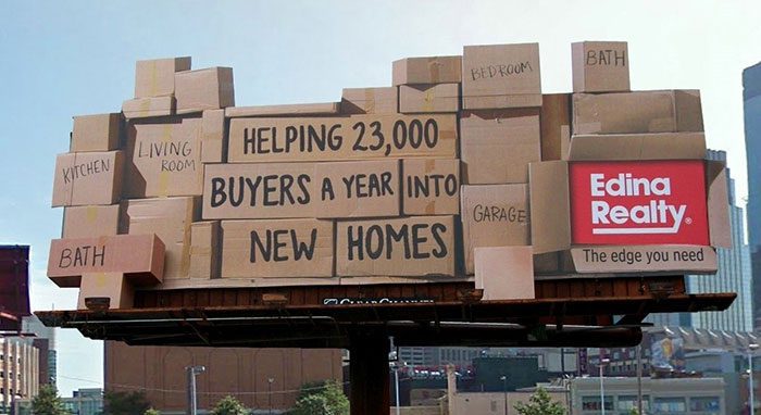
The execution succeeds because it doesn’t need explanation. It triggers recognition—“Yes, moving is exactly like that.” Expert lesson: when your target audience shares a common pain point, build an ad that mirrors the pain point so accurately it feels like you’ve been reading their diary.
25. Building With the Sky as the Canvas (LEGO)
LEGO is about imagination, creation, and seeing possibilities in empty space. This billboard plays a clever perceptual trick: at first glance, it looks like nothing but sky and clouds. Then you realize the “build” is the message—creation in progress, the world as a place you can construct.

Expert takeaway: negative space is not emptiness; it’s a tool. In cluttered urban environments, an ad that feels airy and minimal can be the most disruptive—because it refuses to compete on noise.
26. Dracula That Only “Makes Sense” After Dark (BBC)
Some of the strongest billboard ideas are time-dependent: they change meaning based on lighting, shadows, or the viewer’s commute schedule. This Dracula billboard becomes fully readable at night, when the horror theme feels more alive and the imagery can transform.
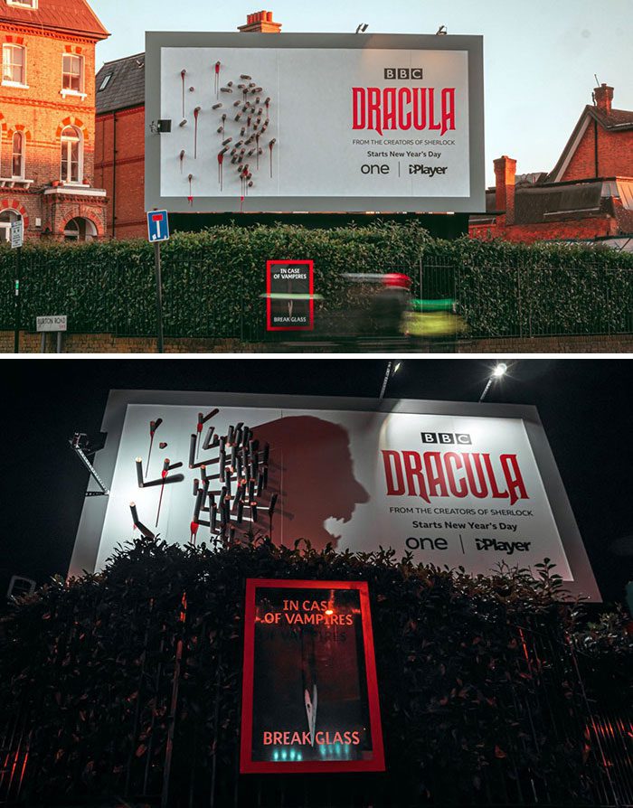
From an expert perspective, this is smart media planning disguised as art. It rewards nighttime viewers with a reveal, which increases memorability. The lesson: if your content has a natural “best time” (horror at night, coffee in the morning), consider designing the billboard to peak when the audience is most receptive.
27. Nighttime Drama for a Fantasy Game (Nintendo Switch / Zelda)
Launch campaigns succeed when they communicate a feeling, not just a product. This billboard becomes more captivating after sunset, when lighting effects and the darker sky create a mood that fits the game’s adventurous tone.
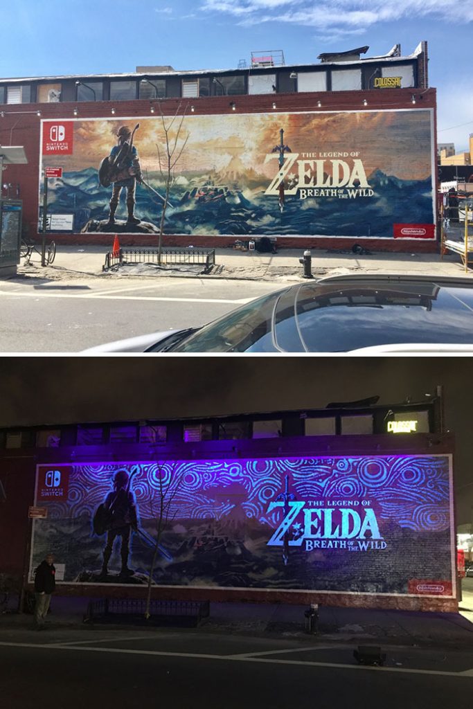
Expert takeaway: outdoor ads don’t have to be static. They can feel dynamic through light, contrast, and context. If your product is entertainment, your billboard should act like entertainment—a small moment of spectacle that makes people want the full experience.
28. A Theme Park Tease That Feels Like a Portal (Star Wars)
For a franchise this iconic, the job isn’t “awareness.” It’s anticipation. This billboard taps into nostalgia and wonder—inviting fans to imagine stepping into the universe, not simply watching it. The execution feels like a gateway rather than an ad.
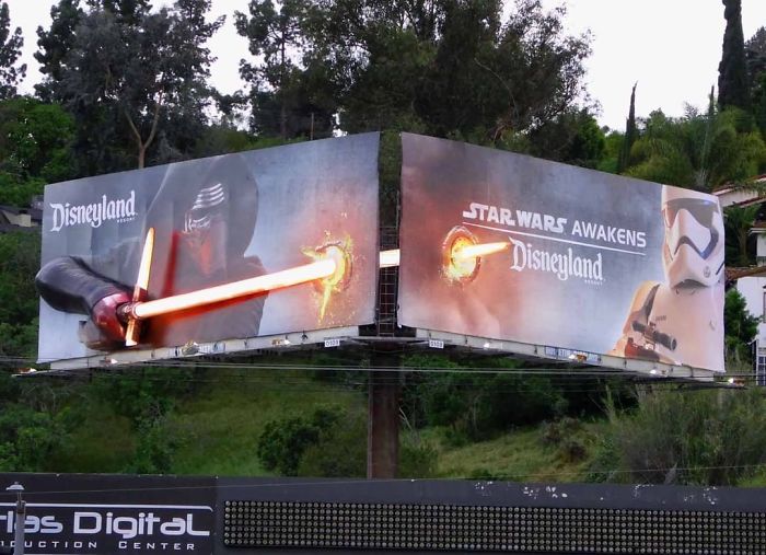
From a professional standpoint, experiential promise is everything for attractions. The lesson: if your offering is immersive, your marketing should behave as though it’s already part of the immersive world—design like a prop, not a poster.
29. A Bike That Lives Half in 2D, Half in 3D (Stranger Things)
This campaign leverages the show’s core theme—parallel realities—using a bicycle split between flat design and dimensional build. It’s a visual metaphor that communicates “two worlds” without a paragraph of explanation.
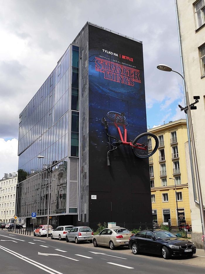
Expert takeaway: the best entertainment billboards don’t summarize the plot. They translate the premise into a single symbolic moment. If your brand has a “big idea,” find one object that can carry that idea visually—then execute it with craftsmanship people can’t ignore.
30. Tiny Billboard, Perfectly On-Brand (Ant-Man)
Sometimes scale is the entire joke. A miniature billboard at a bus stop is a brilliant way to communicate Ant-Man’s defining ability. The idea is instantly legible: the ad is small because the hero is small. It’s playful, and it respects the audience’s intelligence.
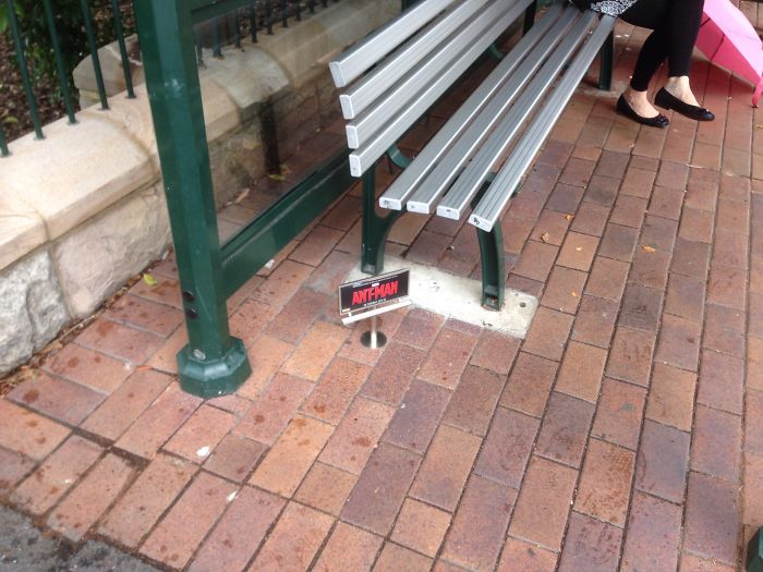
From an expert view, this is a lesson in restraint. They could have built a massive spectacle, but they chose the more elegant solution: a tiny intervention that people discover. The takeaway: not all outdoor wins come from being bigger. Sometimes being unexpectedly smaller is more disruptive.
31. A Road That Looks Like a Toy Track (Hot Wheels)
Hot Wheels is built on childhood imagination—cars that loop, jump, and do things real roads never do. This billboard makes the roadway itself feel like a toy track, creating a moment of playful confusion: “Is that road… bending?”
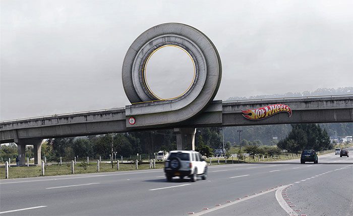
Expert takeaway: strong kid-focused (and kid-adjacent) brands win by visualizing fantasy in the real world. The ad effectively invites adults to remember what it felt like to play, and invites kids to stare longer. Nostalgia is a powerful amplifier.
32. A City Building Attacked by Mutated Creatures (Rampage)
Action films sell intensity. This billboard goes beyond a standard character poster by making it look as if giant creatures are climbing the building itself. The placement turns the city into part of the movie’s chaos, which is exactly the emotional promise of a spectacle film.
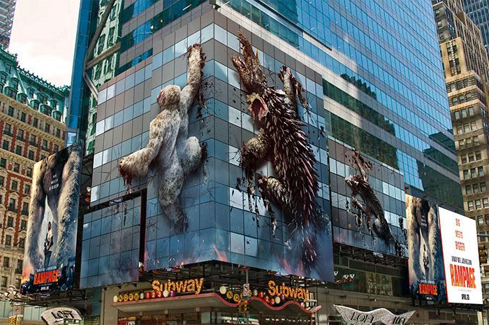
The professional lesson: when your product is “big,” your media should behave big. Outdoor is one of the few channels where scale can literally become part of the storytelling. If your audience wants spectacle, give them spectacle before they buy a ticket.
33. Sci‑Fi Grandeur With a Billboard That Feels Cinematic (Valerian)
Some films require world-building, and a billboard can either feel like a flat ad or a window into the universe. This execution leans into the latter. The design and production make the placement feel like a cinematic artifact rather than a routine promo.

Expert takeaway: genre matters. Comedy ads can be simple; epic sci‑fi often needs texture, depth, and visual richness. The billboard becomes a promise of production value. If your brand’s offering is premium, your outdoor execution must signal “premium” at a glance.
34. A Gentle Bull With a Surprisingly Strong Road Presence (Ferdinand)
Ferdinand is an unusual protagonist: a peaceful bull in a world that expects aggression. The billboard reflects that contrast and uses the road environment to make the character feel “present,” as if he has wandered into our world.
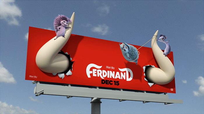
From an expert angle, this is about character clarity. You don’t need to know the entire plot to feel intrigued—because the visual communicates personality. The lesson: if your brand has a distinctive “tone” (gentle, rebellious, elegant), your billboard should express tone more than information.
35. Dinosaurs Along the Highway (Museum Promotion)
Nothing says “you should visit a museum” like the illusion that a prehistoric creature is already outside. This billboard plays on scale and surprise, using an iconic subject—dinosaurs—to trigger curiosity and a childlike sense of awe.
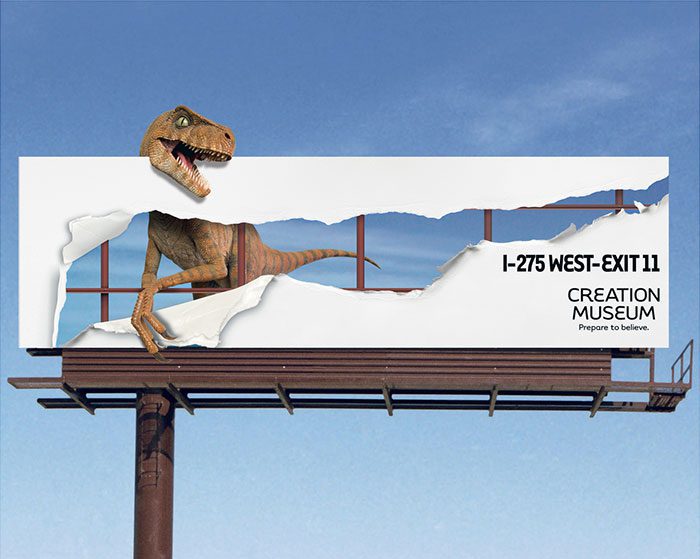
Expert takeaway: when your product is inherently visual (museums, exhibits, attractions), the ad should preview the experience in a literal way. Don’t describe wonder—manufacture a small moment of wonder on the roadside.
36. A Black Hole That “Stretches” the Billboard (Liberty Science Center)
Science can be hard to communicate quickly. This billboard solves that by visualizing one of the most memorable black-hole concepts: objects deform as they get pulled inward. The design makes the billboard appear warped, turning physics into a visual joke you can instantly understand.

From a professional view, educational advertising works best when it feels like a demonstration, not a lecture. The lesson: if your product is knowledge, your billboard should teach one fascinating thing in one second—then let curiosity do the rest.
37. A Casino Billboard That Unexpectedly Talks to Families (Fallsview Casino Resort)
Resorts often struggle with perception: people assume “casino” means adults-only, gambling-only, or money-losing by default. This billboard reframes the destination by displaying kid-friendly items and playful imagery—suggesting it’s a broader entertainment venue.
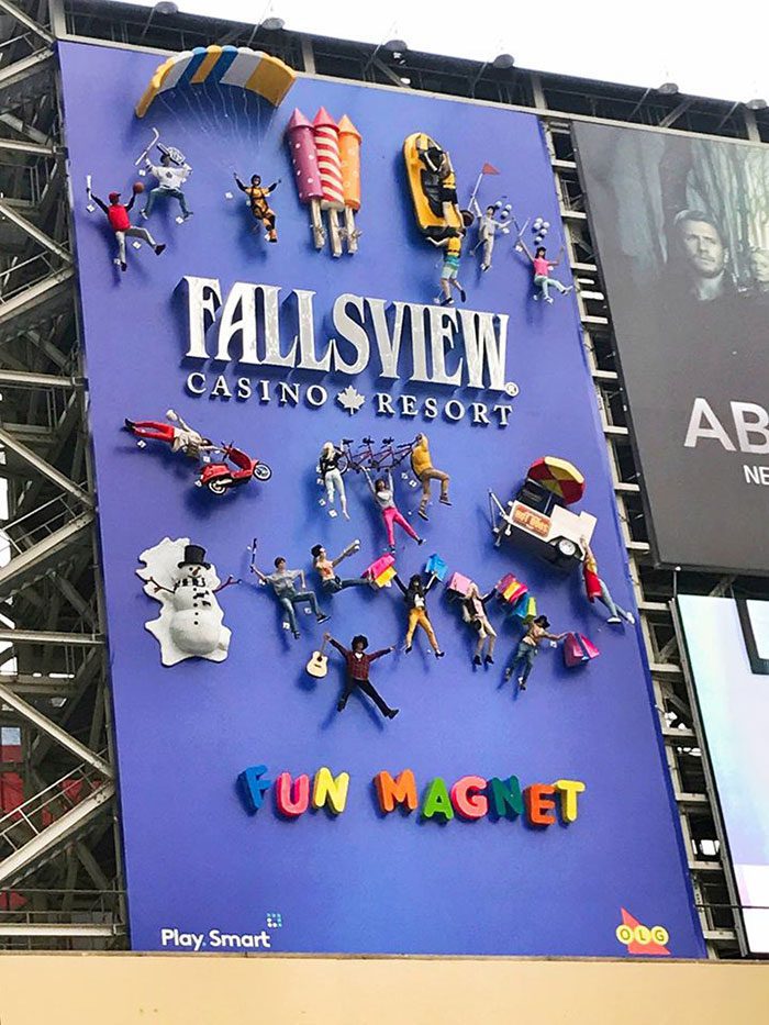
Expert takeaway: sometimes the main job of advertising is repositioning. If the public has a narrow assumption about your brand, don’t fight it with a paragraph. Replace it with a strong, contradictory image that expands what people believe is possible.
38. Nostalgia as a Billboard Strategy (iPod)
The iPod era shaped how people relate to music: playlists became personal identity, earbuds became everyday gear, and “a thousand songs” felt like science fiction. This billboard taps into that cultural memory, reminding viewers of the emotional role the device played in their lives.
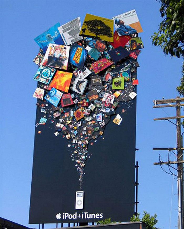
Expert takeaway: nostalgia works when it triggers a specific time and feeling, not generic “remember this?” energy. Outdoor is ideal for nostalgia because commuters are often in reflective mode. If your brand has heritage, use it—but do it with a crisp, iconic visual cue.
39. Local Culture Woven Into a Global Brand (Coca-Cola Knit Billboard)
Global brands can feel distant unless they prove they understand local identity. This billboard connects Coca-Cola to Serbian tradition by using hand-knit craftsmanship. The medium becomes a message: “We’re part of your community, not just your shelves.”
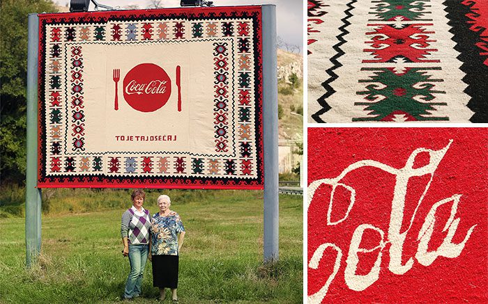
Expert takeaway: localization isn’t only translation of words. It’s translation of values and aesthetics. If you operate globally, consider campaigns that borrow real local craft, real local symbols, and real local hands—because authenticity is a form of competitive advantage.
40. “Real-Time” Weather With Almost No Billboard at All
Sometimes the smartest creative choice is to remove the creative. This billboard uses a frame and lets the sky do the work, effectively turning the environment into a live weather display. Conceptually, it’s elegant: the medium is the message, and the content updates itself.
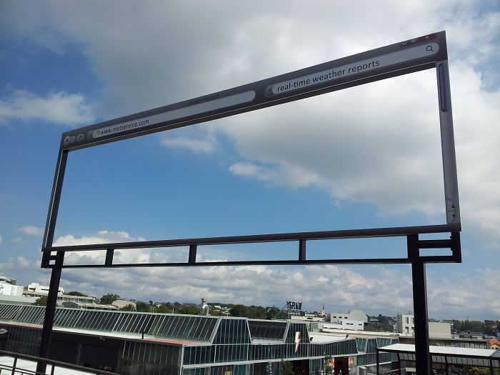
The expert lesson is about restraint and confidence. A campaign doesn’t need to shout to be smart, but it must remain legible at real viewing distances. Takeaway: if your concept depends on subtlety, test readability aggressively—outdoor is unforgiving when text is too small or contrast is too low.
41. The Dog Who Can’t Reach the Ball (And Makes You Look Twice)
This billboard triggers empathy first and understanding second. You see a sad dog and instinctively ask, “What’s wrong?” Then you notice the tennis ball placed just out of reach, and the emotional story clicks into focus.
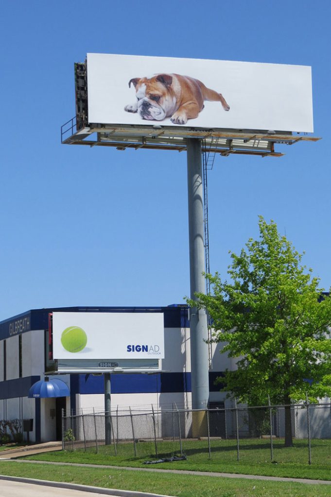
Expert takeaway: curiosity is a powerful hook, but you must reward it quickly. The best “puzzle” ads work because the answer is discoverable within seconds. If viewers need a full minute—or an explanation from a friend—you’ve lost the outdoor audience. This one sits near the line, which is why people talk about it.
42. “We Spent the Budget on Customer Service” (A Self-Aware Billboard)
This billboard uses a meta-joke: the ad looks underfunded on purpose, implying the company chose service quality over flashy marketing. It’s a clever reversal of what people expect from advertising, and that reversal is what earns attention.
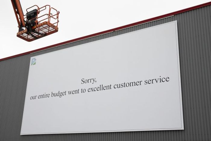
From an expert lens, this is brand positioning through humility. It says, “We know you’re tired of empty hype.” The lesson: if your competitive strength is service, reliability, or trust, you can signal that strength by refusing to look overly polished—so long as the intention is clear.
43. A Child “Drawing” the Sky (Faber‑Castell)
Creativity tools are hard to differentiate because pencils are pencils—until an ad reminds you what creativity feels like. This billboard makes it look as if a child is literally coloring the sky, turning imagination into a public event.
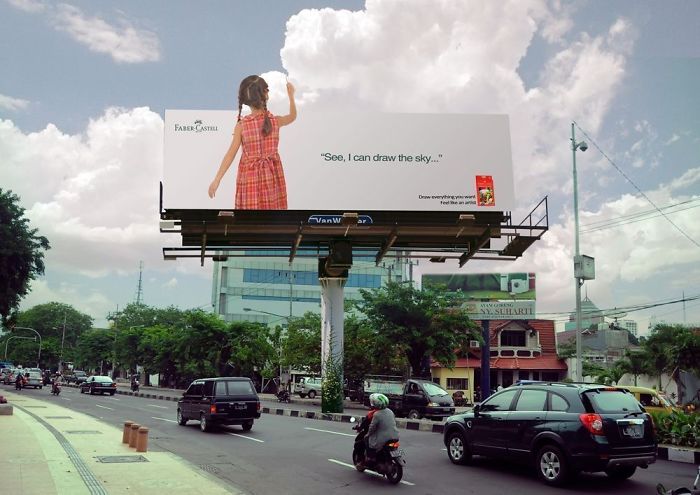
Expert takeaway: the best product ads for creative tools rarely focus on the tool; they focus on the outcome—expression, play, possibility. Outdoor works especially well for this because it lets the brand “interact” with massive, shared canvases like walls, buildings, and the open sky.
44. 3D Balloons That Make an Event Feel Like a Carnival (Calgary Stampede)
Events sell emotion: anticipation, fun, social energy. A 3D billboard is practically built for that job because it can feel like a piece of the event escaped into the city. Here, the balloons and dart create a playful “game booth” vibe you’d expect at a fair.

Expert takeaway: if your offering is experiential, your ad should create a mini-experience. The billboard becomes a preview of atmosphere. And atmosphere is often what convinces people to buy tickets, not detailed schedules or lineup lists.
45. A Tropical “Window” That Makes Winter Feel Personal (Bahamas Tourism)
This billboard is emotional timing with surgical precision. Placed in a cold city, it shows sun, sand, and a warmth you can almost feel. The contrast creates a craving—not just for travel, but for relief. It’s one of the oldest tourism tricks, and it still works because human bodies hate being cold.
Expert takeaway: outdoor advertising is uniquely powerful at leveraging contrast between the viewer’s current environment and the environment you’re selling. If your product is an “escape,” place your message where the need for escape is highest—and make the contrast instantly visible.
What These 45 Billboards Reveal About High-Performance Outdoor Advertising
When you step back from the individual executions, a few repeatable patterns emerge—principles you can apply whether you’re promoting a movie, a restaurant, a public-service message, or a consumer product.
1) The best billboard ideas are built for speed
Outdoor audiences are in motion. Even pedestrians are cognitively “in transit,” scanning for signals. The winning ads above communicate in a single beat: a headache feels like impact; tape holds everything; a snake means “protect species”; a popsicle means “cooling relief.” If your concept requires multiple sentences to explain, it may be better suited to another channel.
2) Physical reality can be your creative advantage
Digital ads compete in infinite scroll. Billboards compete in real space. That’s a gift. You can use shadows, depth, weather, architecture, local culture, and even flaws in the placement as ingredients. The Panasonic “nose hair” and the LEGO “sky build” show how powerful this can be when done thoughtfully.
3) “One message” is not a limitation—it’s a discipline
Many brands try to cram a product sheet into a billboard. The best campaigns do the opposite: one idea, one visual metaphor, one action. When a billboard is that focused, the audience doesn’t feel burdened—they feel rewarded for noticing.
4) Emotion is often the shortest path to recall
Pain relief, hunger, nostalgia, wonder, relief from heat, the desire to escape winter—these are fast emotions, and fast emotions are compatible with outdoor media. If your message can connect to an immediate feeling, you reduce the time it takes to understand why the ad matters.
5) Utility earns goodwill
Ads that help people—pointing to recycling bins, giving directional cues, reminding about seat belts—do something more than sell. They build permission. In a world where people are tired of being marketed to, usefulness can be a competitive advantage.
If you’re developing your own outdoor campaign, here’s a practical, expert-level checkpoint: ask whether your billboard would still make sense if the viewer only looked at it for two seconds. If the answer is no, simplify. Then ask whether your billboard uses its location in a way a digital ad never could. If the answer is also no, you may be leaving the most powerful part of outdoor media on the table.