When you hear the word “Logo,” what thoughts run through your head? We might all agree that logos are distinctive marks that are connected with a certain company. It is essential for the development of a company’s brand to have original logos. You do not want to choose something that is very complicated to the point where people have trouble comprehending what it is supposed to stand for. The logos of some of the most luxurious automobile manufacturers are among the simplest and most easily recognizable in the industry. When designing a logo, your goal should be to ensure that people can recognize your brand even if it does not include your company name. Let’s investigate the history behind some of the most distinctive car company logos.
Lamborghini
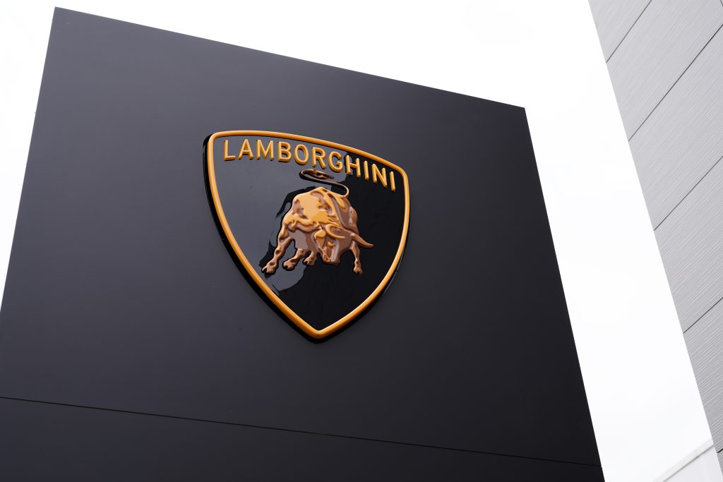
One of the most well-known luxury brands is Lamborghini. In honor of their founder’s sun sign, the Taurus, they chose a bull as their Iconic Logo. For Lamborghini, bullfighting dates back to the 1960s, when the company’s founder, Ferruccio Lamborghini, became interested in the sport. Because the Lamborghini logo speaks for itself, you don’t even need to know the brand name to identify a Lambo.
Cadillac
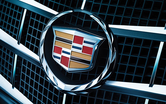
Antoine de la Mothe Cadillac’s crest was actually made up
For its logo in 1902, the Cadillac Automobile Company decided to use the emblem created by Antoine de la Mothe Cadillac, who founded the city of Detroit in 1701. The mystery deepens, however, as it turns out that he went by the alias ‘Antoine de la Mothe Cadillac.’ When he enlisted in the military at the age of 24, he used it to convey the impression that he was a well-to-do member of society.
No one could verify Cadillac’s true ancestry when he arrived in the New World, so he created a coat of arms from numerous sources. Boldness, virtue, and bravery are symbolized by the three colored bands. In addition to the prancing stallion and pouncing huge cat depicted above and below, the crest featured a crown, a wreath, and many Merganser ducks.
In 1999, 2002, and 2014, the ducks and crown of the Cadillac insignia were replaced by a sleeker, more modern metallic shield.
Jaguar
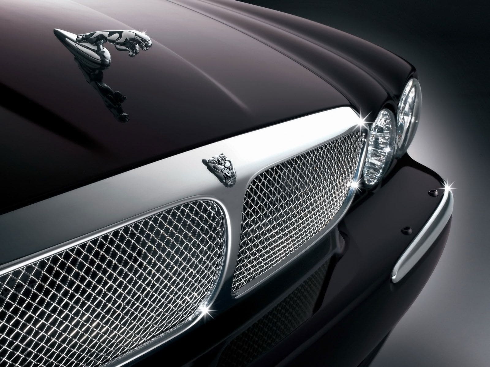
Jaguar’s distinctive hood ornaments are no longer permitted
The leaping jaguar is a powerful symbol of speed, strength, and power, making it an excellent addition to our collection of famous automobile logos. Black, metallic grey, and gold are commonly used to signify elegance, integrity, and high-performance, as well as class and sophistication, in a simple yet refined color palette.
Jaguar automobiles used to have a distinctive decoration that jumped from the hood or bonnet, but pedestrian safety standards have since made it illegal.
Mercedes-Benz

The three-pointed star shows dominance of sea, air and land
When it was first introduced, Mercedes-three-pointed Benz’s star was a delightful symbol of German ingenuity and craftsmanship.
After drawing a star above his house on a postcard in Cologne and sending it to his wife in 1872, Deutz’s technical director Gottlieb Daimler promised that one day he’d have his own factory adorned with the sign.
That triangular star became the trademarked emblem of Daimler-Motors-Gesellschaft in 1909. Renamed Mercedes-Benz after 1926 merger, the company’s laurel wreath was replaced by an unadorned ring in 1933.
For Mercedes-Benz, making automobiles isn’t the only thing they do; they also build planes, helicopters, and submarines.
Volvo
Volvo’s symbol represents war, iron, and masculinity
Volvo’s logo has an interesting story behind it, and it’s one that’s based on mythology and old symbolism from Sweden. The Roman deity Mars, who has long been connected with war and weapons, is also the alchemy sign for iron and masculinity, making it a powerful symbol for the company.
During the 1920s, Volvo sought a mark that reflected the company’s reputation as a manufacturer of safe, durable, and trustworthy vehicles. The word “Volvo” is derived from the Latin phrase “I roll,” although the relationship with automobiles is purely coincidental. It’s a nod to the company’s earliest products, which were ball bearings.
Alfa Romeo
Alfa Romeo’s serpent isn’t eating a man – he’s being reborn
You’d be right if you guessed from one glance at the Alfa Romeo logo that there’s a good story behind it. A man-eating snake appears to have replaced Milan’s red cross on the left side of the logo, which is the home of the Italian automaker.
One of Otone Visconti’s alleged exploits during the First Crusades was to steal a Saracen’s shield shield with the sign of a serpent eating one of its victims. Alfa Romeo, on the other hand, believes that the man emerges from the serpent as a symbol of rebirth.
Chevrolet
Not even the founder’s family agrees on Chevy’s logo origins
The history of a well-known logo’s origins can be murky at times, as is the case with the ‘bowtie’ trademark established by American automobile manufacturer Chevrolet. There are in reality three separate tales of its origin story from three members of the Durant family.
Despite Durant’s claim that the design was based on wallpaper from a French hotel, the design was reaffirmed in Chevrolet’s 50th-anniversary issue of the magazine.
A 1911 newspaper advertisement for “Coalettes” gasoline, according to Catherine, was the source of inspiration. After arguing that Durant simply sketched a nameplate design “in between the soup and the fried chicken” one night, their daughter Margery countered.
With its 100th-anniversary release, Chevy concedes that the logo’s true origins are unknown.
Audi
“If you like it, you should have put a ring on it,” they were told, but they chose Four rings instead. What a big promise to make. Audi is known for its logo, which is four rings joined together. Their famous logo represents the four companies that came together in the 1930s to become one. What an impressive and easy way to make a logo that people will remember.
Bentley
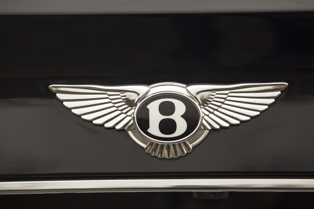
Bentley has always been surpassed by the best of the best in the motor industry. Bentley’s emblem, a B enclosed by two wings, is one of the most recognizable automobile logos. With the B representing Bentley and the wings, even automobiles may fly proportionally to their speed. A lot of bravado but still impressive, right? And did you know that the feathers on the right and left wings vary according to the complexity of their structure?
Ferrari
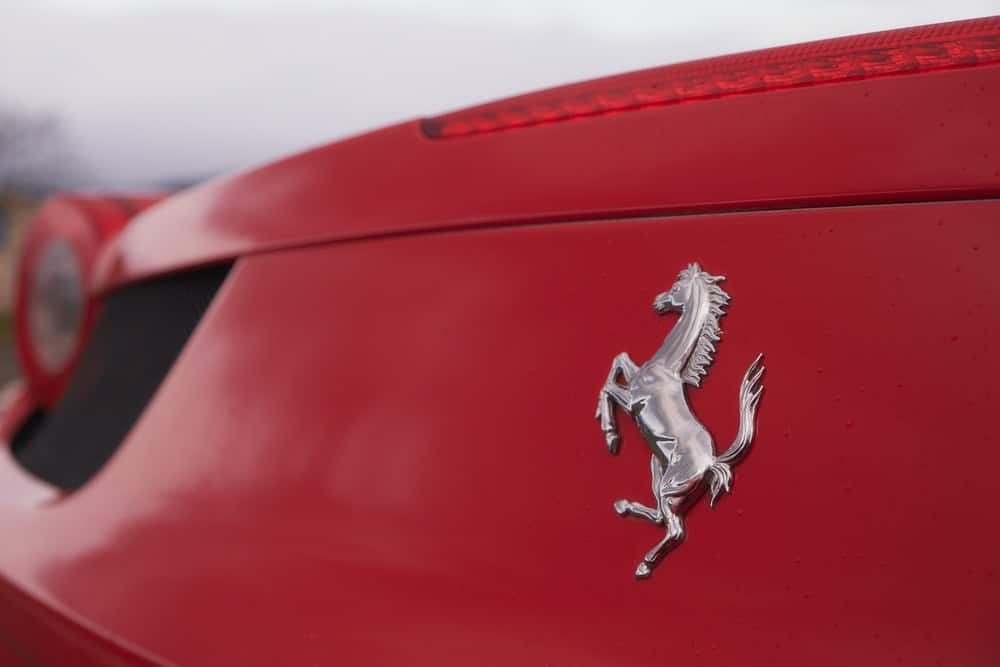
Enzo Ferrari first spotted the prancing horse that would later grace his eponymous sports cars on the side of Count Francesco Baracca’s First World War fighter plane.
Baracca’s parents persuaded Ferrari to use the sign as his emblem, since they believed it had brought good fortune to their son. He did so in 1929 when he founded the Scuderia Ferrari racing team, adding canary yellow as a tribute to his hometown of Modena.
Currently, Ferrari-branded stuff generates nearly as much revenue as the automobiles themselves.
However, Count Baracca was not so fortunate, as he was later killed in combat. As a sign of respect, Ferrari made the horse black instead of red, as it was on the plane, in memory of the ace pilot who inspired the emblematic horse.
A logo must speak for its brand and convey a relatable narrative without using words.

