Cars are a part of our daily lives, and they come in all shapes, sizes, and brands. Car brands have become a symbol of status, luxury, and style. Whether you’re a car enthusiast or just an average driver, you’re bound to have a favorite car brand. In this article, we’ll provide you with an overview of the top 30 most popular car brands around the world.
Car brands are more than just a name. They are an identity, a lifestyle, and a statement. Each car brand has its own unique logo that represents its brand identity. Car logos have become iconic, recognized worldwide, and are often used as a symbol of status and luxury.
Car logos are the face of automobile manufacturers, and they play an important role in brand recognition and identity. Every car logo has a unique design that represents the brand’s values, history, and personality. In this article, we will explore some of the most popular car brands and their logos.
In this article, we will take a closer look at the top 30 most popular car brands in the world and their logos. From traditional brands like Toyota and Honda to luxury brands like BMW and Mercedes-Benz, we will provide you with an overview of the brands that are shaping the automotive industry.
History of Car Logos: How Brand Identity Evolved Over Time
The logos of car brands are an essential part of their identity, and they have undergone many changes over the years. Here’s a brief history of how some of the most iconic car logos have evolved over time:
Top 30 Most Popular Car Brands
- Toyota
- Lexus
- Ford
- Honda
- Chevrolet
- Nissan
- Hyundai
- Kia
- Mercedes-Benz
- BMW
- Audi
- Volkswagen
- Subaru
- Dodge
- Jeep
- Ram
- Porsche
- Mazda
- GMC
- Buick
- Cadillac
- Chrysler
- Volvo
- Mitsubishi
- Acura
- Infiniti
- Tesla
- Land Rover
- Jaguar
- Mini
Hottest: Top 60 Funny Car Stickers You’ve Never Seen Before
The Logos of Popular Car Brands
Car logos are an essential part of the automotive industry, and they often represent the brand’s values, history, and identity. Let’s take a closer look at the logos of the top 30 most popular car brands.
Toyota: The History and Significance of Its Iconic Logo
The Toyota logo consists of three overlapping ovals, which represent the brand’s commitment to customer satisfaction, continuous improvement, and innovation.
Toyota is a Japanese car manufacturer that was founded in 1937. Today, it is one of the largest car companies in the world, producing a range of vehicles from small cars to large SUVs. The Toyota logo is one of the most recognizable logos in the automotive industry, featuring three overlapping ellipses that form a stylized “T”.
The origins of the Toyota logo date back to 1936 when the company was still known as Toyoda Automatic Loom Works. The company’s founder, Kiichiro Toyoda, wanted to create a new logo that would represent the company’s commitment to innovation and progress. He chose the three ellipses because they represent the unification of the hearts of the customer, the product, and the company.
The significance of the Toyota logo goes beyond its aesthetic appeal. It is a symbol of the company’s core values, including customer satisfaction, quality, and innovation. Toyota is known for its reliable, high-quality vehicles that are designed to meet the needs of drivers around the world.
In addition to the iconic logo, Toyota is also known for its innovative technology, including its hybrid engines and safety features. Notable models include the Corolla, Camry, and Prius, which have become household names in the automotive industry.
Lexus
Lexus is a luxury car brand owned by Toyota and was introduced to the market in 1989. The Lexus logo features an elegant and sleek design that embodies the brand’s commitment to luxury and sophistication. The logo is a stylized “L” that is positioned inside an oval shape. The oval shape represents the globe and symbolizes the brand’s global reach.

The “L” in the logo stands for Lexus and is surrounded by a metallic ring, which represents the brand’s pursuit of perfection and the precision of its engineering. The logo’s color is a deep shade of blue, which is said to represent excellence, trust, and reliability. Overall, the Lexus logo is a perfect representation of the brand’s commitment to luxury, precision, and quality.
In recent years, Lexus has been expanding its lineup of hybrid and electric vehicles to meet the growing demand for more eco-friendly options. The brand’s commitment to innovation and sustainability is reflected in the design of its logo, which embodies the values and characteristics that define the Lexus brand.
Ford: The Blue Oval That Stands for American Pride
The Ford logo features a blue oval with the company name in white letters. The oval represents trust, quality, and excellence, while the blue color symbolizes strength, loyalty, and dependability.
Ford Motor Company is an American multinational automaker that was founded in 1903. The company’s headquarters are located in Dearborn, Michigan, and it is one of the largest car manufacturers in the world. Ford is known for producing reliable and affordable vehicles that are popular with consumers.
The Ford logo features a blue oval with the name “Ford” written in white letters. The logo is a symbol of American pride and innovation, and it has been used by the company since 1909. The blue color represents trust, loyalty, and reliability, which are all qualities that Ford strives to embody.
Ford produces a wide range of vehicles, including cars, trucks, and SUVs. Some of the most popular Ford models include the F-150, Mustang, Explorer, and Escape. Ford is also committed to producing electric and hybrid vehicles, and it has recently introduced the Mustang Mach-E electric SUV to its lineup.
In addition to producing vehicles, Ford is also involved in various charitable and community initiatives. The company has donated millions of dollars to support education, environmental conservation, and disaster relief efforts around the world.
Overall, Ford is a well-respected and popular car brand that is known for producing reliable and affordable vehicles. With its commitment to innovation and community involvement, Ford is a brand that is likely to remain popular for many years to come.
Honda: The Story Behind the “H” Logo
The Honda logo consists of a stylized “H” inside a red circle. The “H” represents the brand name, while the red color symbolizes energy, passion, and excitement.

Honda is one of the most well-known car brands in the world. It was founded in 1948 by Soichiro Honda and Takeo Fujisawa and has since become known for its reliable and efficient cars. The Honda logo is a simple “H” design, but there is actually a lot of meaning behind it.
The logo was first used in 1964 and was designed to represent Honda’s commitment to innovation and progress. The two upright lines in the “H” symbolize the company’s commitment to moving forward and making progress, while the horizontal line in the middle represents stability and balance.
The color of the logo is also significant. The red color symbolizes passion, energy, and excitement, while the silver color represents innovation, sophistication, and technology. Together, these colors and symbols create a powerful image that represents Honda’s commitment to excellence.
Today, Honda is one of the most popular car brands in the world, with a wide range of models available to suit every need and budget. From the compact Fit to the luxurious Acura RLX, Honda has something for everyone.
In addition to its cars, Honda is also known for its motorcycles, power equipment, and even airplanes. The company’s commitment to innovation and progress has led it to become one of the most respected and admired brands in the world.
Whether you’re looking for a reliable commuter car or a high-performance sports car, Honda has something for you. With its commitment to innovation, quality, and customer satisfaction, it’s no wonder that Honda is one of the most popular car brands in the world.
Chevrolet: The Bowtie That Became an American Icon
The Chevrolet logo features a golden bowtie with the company name in black letters. The golden color represents excellence and prestige, while the black color represents sophistication and professionalism.
The Chevrolet logo has become an American icon, representing a century of automotive innovation and excellence. It is one of the most recognizable logos in the world. The bowtie logo has a fascinating history that dates back to 1913, when co-founder William C. Durant was inspired by the wallpaper in a Parisian hotel room. He tore off a piece of the wallpaper and brought it back to the United States, where it became the basis for the famous logo.
The logo has undergone several changes over the years. The earliest versions featured a bowtie with the company name written in cursive script. In the 1950s, the logo was simplified to the current form, with a gold bowtie and a blue background. The current design is a modern interpretation of the classic bowtie, with a more angular and contemporary shape.
The Chevrolet logo is more than just a symbol of a car company. It represents American innovation, freedom, and strength. The company has a long history of producing high-quality vehicles that have become a part of the American landscape. From the classic Bel Air to the modern Corvette, Chevrolet has always been a company that represents the American dream.
In recent years, the Chevrolet logo has been modernized to reflect the company’s commitment to sustainability and innovation. The company has introduced a range of electric and hybrid vehicles, and the new logo features a blue gradient that represents a cleaner, more sustainable future.
Nissan: The Evolution of Its Logo and Its Importance
The Nissan logo features a silver circle with a red cross inside, which represents the company’s commitment to innovation, quality, and performance.
Nissan is a Japanese car brand that was founded in 1933. Its logo has undergone several changes since its inception. The original logo featured the word “Nissan” in a bold, sans-serif font. In the 1950s, the logo was updated with a new, more modern font. The current Nissan logo was introduced in 1983 and features a stylized representation of a bird with its wings spread.
The bird in the Nissan logo is called the “NISSAN GRAPHIC.” It is a stylized representation of a seagull with its wings spread. The logo’s design was inspired by the company’s name, which is a combination of “Nippon Sangyo” (Japanese for “Japan Industries”) and “Nissan,” a shortened form of “Nihon Sangyo” (Japanese for “Japan Industries”). The bird in the logo symbolizes the company’s soaring ambitions and its commitment to innovation and progress.
The importance of the Nissan logo cannot be overstated. It is one of the most recognizable car logos in the world, and it is a powerful symbol of the company’s identity and values. The logo communicates the company’s commitment to innovation, quality, and excellence. It is a symbol of the company’s history, culture, and vision for the future.
In recent years, Nissan has faced some challenges, including declining sales and a tarnished reputation following the arrest of its former CEO, Carlos Ghosn. However, the company has remained committed to its core values, and its logo continues to be a symbol of its resilience and determination to succeed.
Hyundai: The H Logo and Its Representation of Progress
The Hyundai logo features the letter H, which stands for Hyundai. The H is stylized to create an oval shape, which represents the company’s global presence and forward-looking approach. The H is also slanted at a 45-degree angle, which symbolizes the company’s progressiveness and willingness to take on new challenges.

The color blue is used in the Hyundai logo to represent reliability and trustworthiness. Blue is a calming and soothing color, which is why it is often used in logos for banks and other financial institutions. Hyundai wants its customers to feel secure and confident in their decision to purchase one of their vehicles, which is why blue is such a prominent color in their logo.
Hyundai has been in business since 1967 and has become one of the largest car manufacturers in the world. The company is known for its affordable vehicles that offer excellent value for money. The Hyundai logo reflects the company’s commitment to progress, innovation, and customer satisfaction.
In 2020, Hyundai updated its logo for the first time in almost 20 years. The new logo features a more modern and streamlined design, with a slimmer and sharper letter H. The new logo is intended to represent Hyundai’s vision for the future and its commitment to innovation and sustainability.
Overall, the Hyundai logo is a simple and effective representation of the company’s values and identity. The stylized letter H and the use of blue in the logo convey a sense of reliability, trust, and progress, which are key attributes for any successful car brand.
Kia: The Story of Its Name and the Kia Logo
Kia Motors Corporation, commonly known as Kia, is a South Korean multinational automotive manufacturer. Kia’s logo is a stylized representation of the company name. The word “Kia” is derived from the Sino-Korean words “ki” and “a,” which together translate to “arise” or “come up out of.” The stylized version of the name is a combination of the letters “K” and “I,” forming an oval shape that resembles a tire.

Kia’s logo has undergone several changes since the company was founded in 1944. The original logo featured a stylized tiger head, which represented the company’s original name, Kyungsung Precision Industry. In 1951, the company changed its name to Kia Industries, and the logo was changed to reflect the new name. The new logo featured a stylized “K,” which was surrounded by a circle.
In 1994, Kia underwent a major rebranding effort, which included a new logo. The new logo was designed to represent the company’s commitment to innovation and progress. The stylized version of the company name was updated with a bold, italicized font, and the oval shape was given a sleek, modern look.
Today, Kia’s logo is recognized around the world as a symbol of quality, innovation, and progress. The company has experienced tremendous growth in recent years, and its cars are among the most popular in the world. With a commitment to sustainability, safety, and innovation, Kia is poised to continue its success for years to come.
Mercedes-Benz: A Classic Emblem of Luxury and Elegance
Mercedes-Benz is a well-known luxury car brand that has been around for more than a century. Its logo is a symbol of its elegance, sophistication, and high quality. The Mercedes-Benz logo features a three-pointed star inside a circle. The star is said to represent the brand’s dominance over the land, sea, and air.

The Mercedes-Benz logo has gone through several changes over the years, but its overall design has remained consistent. The logo’s sleek and modern design is a reflection of the brand’s commitment to innovation and progress. The logo’s simple color scheme of silver and black also gives it a timeless and classic look that appeals to consumers who value tradition and style.
One of the most interesting things about the Mercedes-Benz logo is that it is one of the few car logos that doesn’t feature the brand name. However, the logo is so iconic that consumers immediately recognize it as a symbol of Mercedes-Benz’s luxury and prestige.
In conclusion, the Mercedes-Benz logo is a perfect representation of the brand’s commitment to quality, innovation, and luxury. Its timeless design and simple yet elegant color scheme make it a memorable and iconic emblem that is instantly recognizable to consumers around the world.
BMW Logo: A Symbol of Quality and Innovation
The BMW logo is instantly recognizable as a symbol of quality and innovation. The logo consists of a blue and white propeller in a circle, which represents the company’s roots in aviation. BMW started as a manufacturer of airplane engines and transitioned to producing automobiles after World War I. The blue and white colors of the logo are also inspired by the colors of the Bavarian flag, as BMW is headquartered in Munich, Germany.
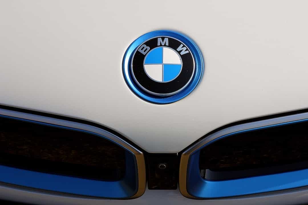
The BMW logo has evolved over time, but the propeller has remained a constant symbol of the company’s engineering excellence. The logo has become synonymous with luxury, performance, and technological innovation. BMW has a reputation for producing high-quality cars that are reliable and stylish.
In recent years, BMW has expanded its product line to include Can we trust electric cars that drive themselves? The company has also been a pioneer in autonomous driving technology, which represents the future of the automotive industry. The BMW logo represents the company’s commitment to innovation and progress.
Overall, the BMW logo is a symbol of quality and innovation that represents the company’s engineering excellence and commitment to technological advancement. The logo has become an iconic symbol of luxury and performance, and it continues to inspire drivers around the world.
Audi: The Four Rings and Its Connection to the Auto Union
The Audi logo consists of four interlocking rings, which represent the four founding companies of the Auto Union: Audi, DKW, Horch, and Wanderer. These companies merged in 1932 to form the Auto Union, which later became Audi AG. The four rings represent the unity of the four companies under one umbrella.

The logo’s design is simple yet elegant, with each ring overlapping the other. The rings are colored in silver, which represents the brand’s premium and sophisticated image. The logo has undergone minor changes over the years, but the four interlocking rings have remained a constant element.
The Audi logo has a rich history, dating back to the early 20th century. The logo’s original design was created in 1909 by August Horch, the founder of Horch Automobile. Horch’s name, which means “listen” in German, was used in the first logo, but after a trademark dispute, Horch had to change the name of his company. He chose the name Audi, which means “listen” in Latin, and used the four rings in the logo to represent the Auto Union.
Today, the Audi logo is recognized globally as a symbol of quality, luxury, and innovation. The logo has evolved over time, but the four rings remain a constant reminder of the brand’s heritage and values.
Volkswagen: The VW Logo and Its Hidden Meanings
The Volkswagen logo, also known as the VW logo, is instantly recognizable thanks to its simple, circular design. Created in 1937 by Franz Xaver Reimspiess, an employee of the company’s advertising department, the VW logo has gone through several iterations over the years.

At the center of the VW logo is a V and a W, which are the initials of the company’s name in German: “Volkswagen.” However, there are also several hidden meanings in the design. For example, the V and W are positioned in such a way that they resemble a gearshift, a nod to the company’s automotive roots. Additionally, the circle surrounding the VW logo represents the world, while the white space within the circle represents the company’s global presence.
Over the years, the VW logo has become one of the most iconic car logos in the world, thanks in part to the company’s commitment to quality and innovation. From the Beetle to the Golf, Volkswagen has produced some of the most beloved cars of all time, and the VW logo is a symbol of that legacy.
In recent years, the VW logo has undergone yet another transformation. In 2019, the company unveiled a new, simplified version of the logo, which features a flatter, more modern design. While the new logo retains the V and W at its core, it eliminates many of the details from the previous design, resulting in a cleaner, more streamlined look.
Overall, the VW logo is a testament to the power of simplicity in design. By combining the company’s initials with a few well-placed symbols, Franz Xaver Reimspiess created a logo that has endured for over 80 years and become synonymous with quality, innovation, and global success.
Mazda: The Meaning Behind the Winged Logo
The Mazda logo is one of the most recognizable car logos in the world. The logo features a stylized letter “M” with a wing-like design that represents Mazda’s desire to soar to new heights. The logo was designed in 1997 by Rei Yoshimara, who wanted to create a logo that was simple, powerful, and modern.
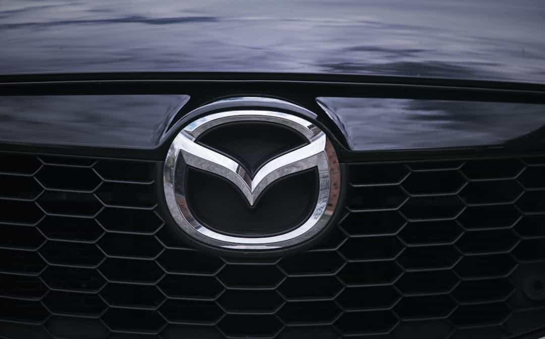
The wing-like design of the Mazda logo is called the “owl’s wings.” The name comes from the idea that the design resembles the wings of an owl in flight. The owl is a symbol of wisdom, which reflects Mazda’s commitment to innovation and technological advancement.
The stylized letter “M” in the logo represents Mazda’s focus on creativity and passion. The letter is bold and distinctive, representing the company’s determination to stand out in the automotive industry.
The red and silver colors in the logo represent passion and creativity, respectively. The combination of these two colors creates a powerful visual impact that helps Mazda stand out from other car brands.
Subaru: The Pleiades Stars and Its Symbolism
Subaru is a Japanese car manufacturer known for its all-wheel-drive vehicles and boxer engines. The company’s logo features a cluster of six stars known as the Pleiades or Subaru in Japanese. The stars represent the six companies that merged to form Fuji Heavy Industries, the parent company of Subaru.

The symbolism behind the logo is rooted in Japanese mythology, where the Pleiades star cluster is known as “Subaru” in Japanese, meaning “united.” The stars are associated with the goddess of harvest, who is said to have descended from the heavens on a chariot pulled by deer, which is also depicted in the logo. The six stars represent the six companies coming together to create a united entity.
The Subaru logo has evolved over time, with minor changes to the stars’ position and size. However, the core elements of the logo have remained the same, reflecting Subaru’s commitment to innovation, quality, and reliability. The logo’s simplicity and elegance have contributed to Subaru’s success, making it a recognizable and respected brand worldwide.
Dodge
Dodge is an American car brand that has been around since 1900. The Dodge logo has undergone several changes over the years, but it has always maintained its iconic look. The current logo features a ram’s head with curving horns, which represents the brand’s association with strength and toughness.
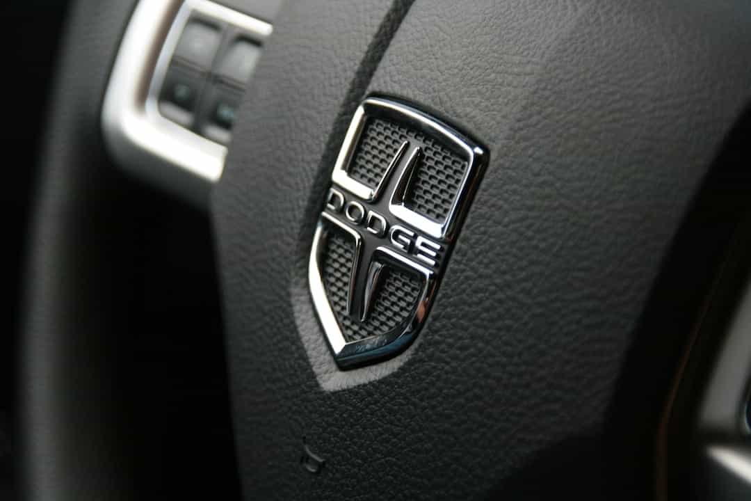
The original Dodge logo, which was used until the 1930s, featured a circle with a pair of interlocking triangles. The triangles represented the brothers John and Horace Dodge, who founded the company. In the 1950s, the company adopted a more stylized version of the ram’s head logo, which was inspired by the hood ornament on the 1930s Dodge cars.
The Dodge logo has always been associated with high-performance cars, and the current logo continues to represent the brand’s commitment to speed, power, and durability. The logo is often seen on the brand’s muscle cars, such as the Challenger and Charger, which are known for their impressive horsepower and speed. Overall, the Dodge logo is a symbol of American muscle and performance, and it is sure to continue to be an iconic logo for years to come.
Jeep
Jeep is an iconic American brand that has been producing rugged and reliable SUVs for over 80 years. The Jeep logo is one of the most recognizable car logos in the world. It features a bold, seven-slot grille that has become synonymous with the brand. The logo’s design is simple yet powerful, representing the brand’s adventurous and rugged spirit.

The Jeep logo has undergone several modifications since its inception. The first Jeep logo featured the brand’s name in bold letters, followed by a silhouette of a Jeep in the background. In the 1950s, the logo was updated to include the iconic seven-slot grille, which has remained a prominent feature in all Jeep logos since then. Over the years, the logo has undergone several minor tweaks to make it more modern and streamlined.
The Jeep logo is more than just a symbol; it represents the brand’s adventurous and rugged spirit. The brand’s commitment to quality and reliability has made it a favorite among car enthusiasts worldwide. Whether you’re driving on the road or off-road, a Jeep will get you to your destination in style and comfort. The Jeep logo is a testament to the brand’s commitment to excellence and innovation.
Peugeot: The Lion Logo and Its French Heritage
The Peugeot logo is a well-known symbol of French engineering and design. The lion, which is the centerpiece of the logo, has been used by the company since 1847 and represents the values of strength, power, and speed. The lion’s head is shown in profile, with a flowing mane and sharp features that convey a sense of grace and agility. The current version of the Peugeot logo was introduced in 2010 and features a more stylized version of the lion’s head.

Peugeot is a French car manufacturer that was founded in 1810 and has a long history of producing innovative and stylish vehicles. The company has been at the forefront of automotive design and engineering, with a focus on producing cars that are both stylish and practical. Peugeot has also been involved in motorsport for many years and has won numerous championships, including the 24 Hours of Le Mans and the Dakar Rally.
The Peugeot logo is a symbol of the company’s long history of engineering and design excellence. The lion, with its regal appearance and powerful features, represents the values of strength, power, and speed that are at the core of Peugeot’s philosophy. The logo is instantly recognizable and has become an iconic symbol of French engineering and design. Whether you’re a fan of Peugeot’s innovative vehicles or simply appreciate the beauty of its logo, there’s no denying the impact that this iconic symbol has had on the automotive industry.
Citroen: The Double Chevron and Its Design Changes
Citroen is a French car manufacturer that has been producing cars since 1919. The company’s logo is one of the most recognizable in the industry, featuring a pair of chevrons that are intertwined. The design of the logo has undergone several changes over the years, reflecting the company’s evolution and modernization.
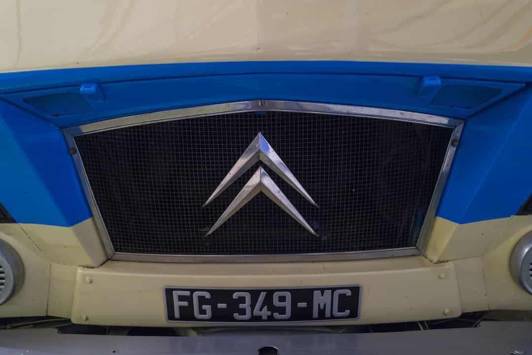
The double chevron logo was first introduced in 1919 and was inspired by the gear teeth on a herringbone gear. It was designed by Andre Citroen, the company’s founder, and was intended to represent the company’s engineering excellence. The logo’s design has evolved over time, with the most significant change occurring in the 1970s when the chevrons were given a more three-dimensional appearance.
In recent years, Citroen has introduced a new logo design that features a more minimalist approach. The new logo features a single chevron with a slightly curved shape, giving it a more modern and dynamic look. The new design is part of Citroen’s efforts to rebrand and modernize its image, reflecting the company’s commitment to innovation and forward-thinking.
Renault: The Diamond Logo and Its Different Versions
Renault is a French car manufacturer that was founded in 1899. The company’s logo features a diamond shape with two interlocking shapes inside. The diamond shape represents the company’s focus on quality and innovation, while the interlocking shapes represent the company’s alliance with Nissan.
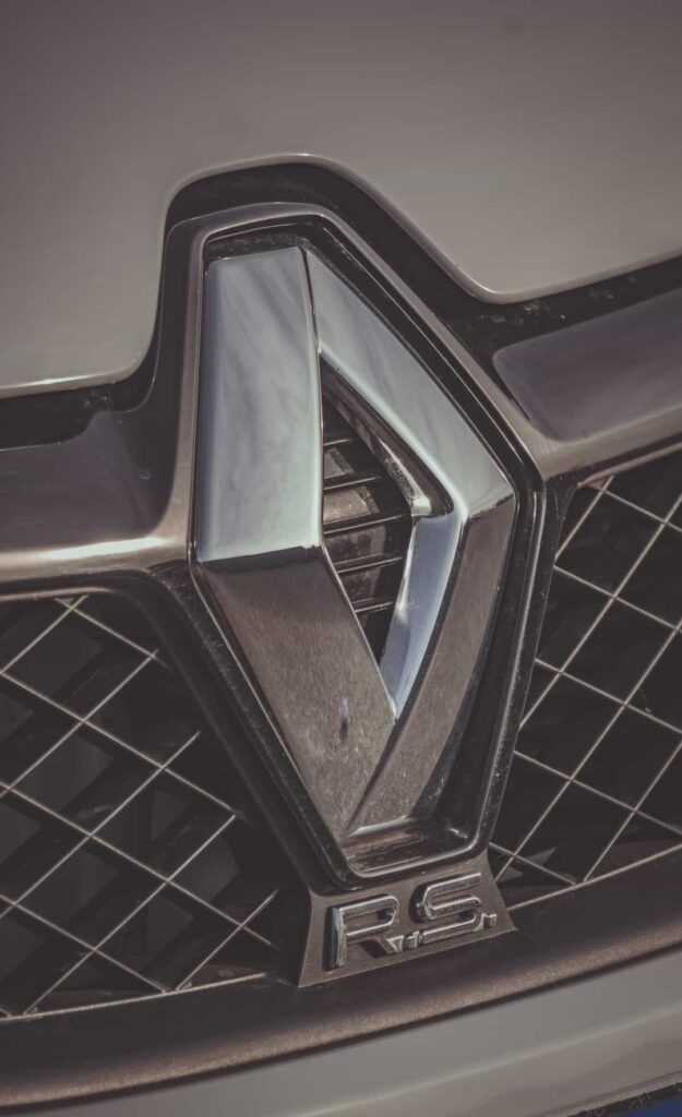
Over the years, the Renault logo has undergone several changes. The original logo featured the company’s name in bold letters, with the diamond shape and interlocking shapes inside. In the 1920s, the logo was simplified to just the diamond shape with the company name written underneath. In the 1970s, the logo was updated again to feature a more stylized diamond shape with a yellow and black color scheme.
In 1992, the Renault logo was updated once again to the current design, which features a more modern and sleek diamond shape with a chrome finish. The company’s name is written in lowercase letters underneath the logo. The current logo has a more futuristic feel, which reflects the company’s focus on innovation and technology.
Overall, the Renault logo has evolved over the years, but it has always remained true to the company’s core values of quality, innovation, and performance. The logo’s diamond shape and interlocking shapes have become iconic symbols of the Renault brand, and they continue to inspire confidence and trust in the company’s products.
Fiat: The Famous Italian Logo and Its History
Fiat is an Italian car manufacturer that has been around since 1899. The company’s name stands for “Fabbrica Italiana Automobili Torino,” which translates to “Italian Automobile Factory of Turin.” The brand has a long and storied history, and its logo is instantly recognizable around the world.

The Fiat logo features a circular badge with a bold red background and the letters “F-I-A-T” in white. The letters are arranged in a stylized, angular font that gives the logo a modern and dynamic feel. The center of the badge features an emblem with a blue shield, a white star, and a red ribbon. The emblem is a nod to the coat of arms of the Italian city of Turin, where Fiat was founded.
Over the years, the Fiat logo has undergone a few changes, but the basic design has remained largely the same. The current version of the logo was introduced in 2006, and it features a slightly updated font and a more streamlined design. Today, the Fiat logo is one of the most recognizable in the automotive industry, and it serves as a symbol of the brand’s commitment to quality, innovation, and style.
Alfa Romeo: The Classic Emblem of Italian Racing Cars
Alfa Romeo’s logo is one of the most recognizable car logos in the world. The logo features a red cross on a white background, with a green serpent eating a man on the right side of the cross. The logo’s design is based on the coat of arms of the Visconti family, who ruled Milan in the 14th century. The serpent eating a man represents the ancient Roman symbol of victory, and the green color symbolizes the Italian racing color.
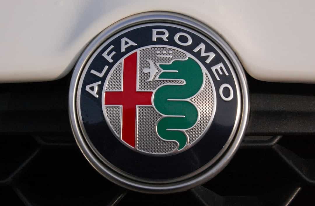
Alfa Romeo is an Italian car manufacturer, founded in 1910 in Milan. The company has a rich history in motorsports, with victories in Formula One, touring car racing, and sports car racing. Alfa Romeo’s cars are known for their sleek designs, powerful engines, and excellent handling. The company’s logo represents the brand’s identity as a symbol of Italian luxury and performance.
In conclusion, Alfa Romeo’s logo is a classic emblem of Italian racing cars, with a rich history and a strong brand identity. The logo’s design reflects the company’s heritage and its commitment to producing high-performance luxury cars. Alfa Romeo’s logo is a symbol of the company’s success in the automotive industry and its passion for racing.
Ferrari: The Prancing Horse and Its Racing Roots
The Ferrari logo is one of the most recognizable car logos worldwide, featuring a prancing horse on a yellow background. The iconic emblem’s history dates back to 1923, when Enzo Ferrari founded the Scuderia Ferrari racing team. In 1929, he decided to use a prancing horse as the team’s logo after meeting Count Francesco Baracca, a World War I hero who painted a prancing horse on his plane.
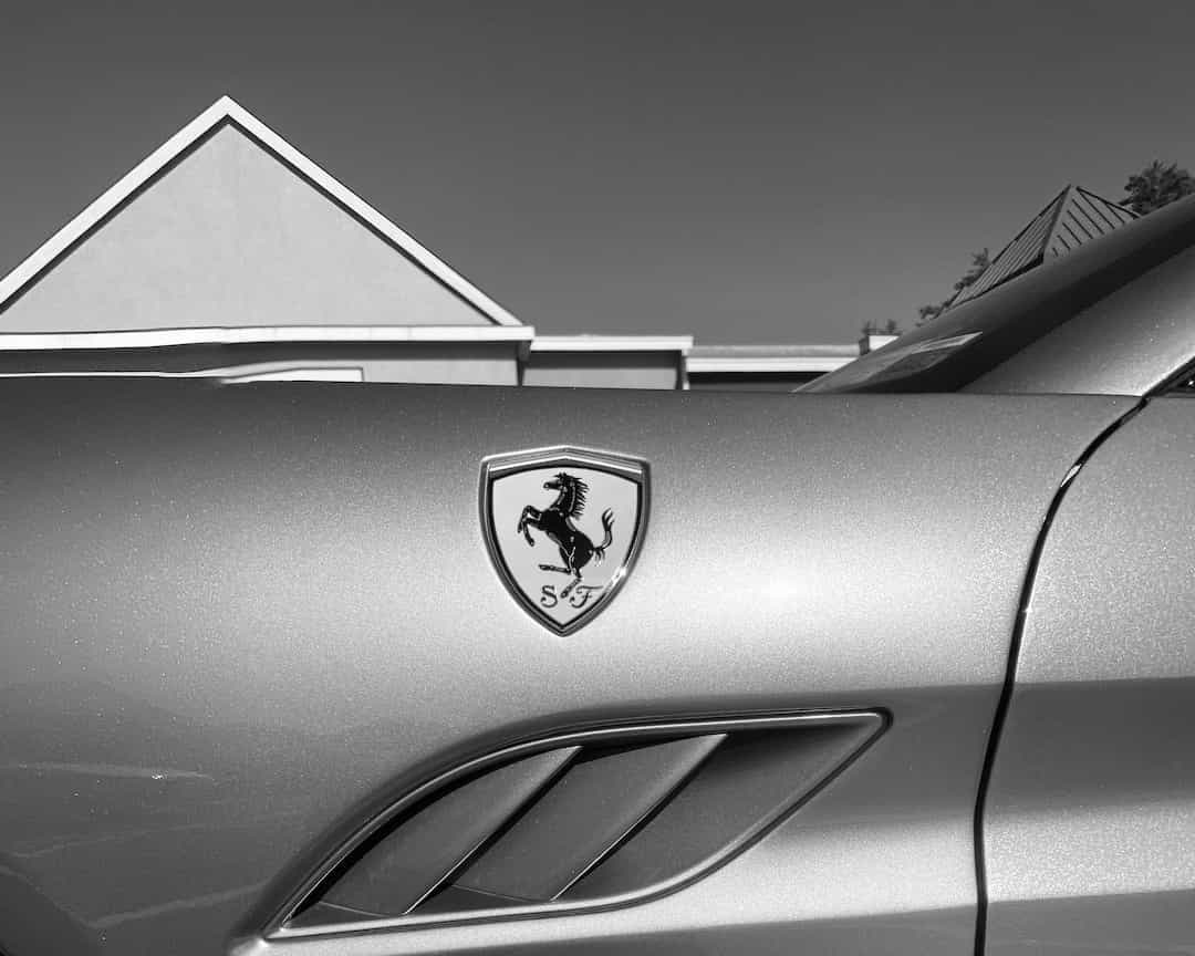
Enzo Ferrari adopted the prancing horse logo as a tribute to Baracca, who died in action. The yellow background was added later to represent the color of the city of Modena, where Ferrari was born. The logo has remained unchanged for almost a century and is now synonymous with luxury, performance, and Italian craftsmanship. Ferrari’s racing heritage and commitment to excellence are embodied in the prancing horse emblem, which has become a symbol of power and prestige.
Ferrari’s success in motorsports has contributed significantly to the brand’s image and popularity. The company has won numerous Formula One championships and endurance races, cementing its position as one of the most iconic car manufacturers in the world. The prancing horse logo has become a status symbol among car enthusiasts, representing not only speed and performance but also exclusivity and sophistication. Ferrari’s logo is an excellent example of how a brand’s history and values can be captured in a simple yet powerful design.
Lamborghini: The Bull Logo and Its Symbolism
The Lamborghini logo is one of the most iconic car logos in the world. It features a charging bull, or “toro” in Italian, against a black shield. The logo has been part of the company’s identity since its inception in 1963 and is recognized worldwide as a symbol of luxury and performance.
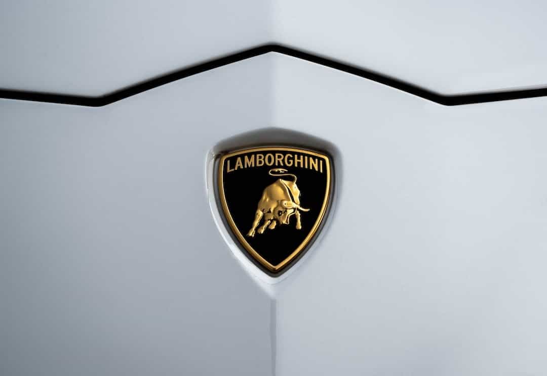
The bull is a powerful and noble animal that represents strength, power, and determination. The founder of Lamborghini, Ferruccio Lamborghini, was born under the zodiac sign of Taurus, which is also represented by a bull. This may have influenced his decision to choose the bull as the company’s emblem.
The logo has undergone a few changes over the years. The original logo featured the bull facing right, but in 1970, it was changed to face left. The black shield with the golden bull has remained unchanged since then, and it continues to be a symbol of Lamborghini’s commitment to luxury and performance. Today, the Lamborghini logo is one of the most recognizable logos in the world, and it continues to represent the company’s commitment to pushing the boundaries of automotive technology.
Porsche: The Crest and Its Connection to the City of Stuttgart
Porsche, a German sports car manufacturer, has a unique logo that represents its heritage and location. The logo features a crest with a prancing horse and antlers, surrounded by red and black stripes. The horse symbolizes the city of Stuttgart, where Porsche was founded, and the antlers represent the coat of arms of the Kingdom of Württemberg, where the city is located.
The Porsche logo’s design has remained unchanged since its inception in 1952, and it has become synonymous with the brand’s luxury and performance. The logo’s black and red stripes were taken from the flag of the Free People’s State of Württemberg, which was a German state until 1952. The horse’s jumping motion conveys the brand’s speed and agility, while the antlers represent strength and durability.
Porsche’s logo is an excellent example of how a brand can connect its identity to its location and heritage. The logo’s design and symbolism have helped Porsche build a strong brand image and reputation for luxury and performance. It is no surprise that the Porsche logo is recognized and respected worldwide, making it one of the most iconic car logos of all time.
In conclusion, a car brand’s logo is more than just a symbol. It represents the brand’s values, heritage, and identity. The Porsche logo is an excellent example of how a logo can connect a brand to its location and history. It is essential for a brand to have a unique logo that sets it apart from others and resonates with its target audience. The Porsche logo’s design and symbolism have helped the brand build a reputation for luxury and performance, making it one of the most recognizable car logos in the world.
Jaguar: The Fierce Animal and Its Representation of Power
Jaguar is a British luxury car manufacturer that was founded in 1922. The company’s logo features a fierce-looking jaguar, with its head turned to the side, and its teeth bared. The jaguar is a powerful and agile animal, known for its strength and speed. The logo was designed to represent these qualities, as well as the elegance and sophistication of the Jaguar brand.
The jaguar in the logo is a reflection of the company’s commitment to producing cars that are powerful, fast, and stylish. The logo’s sleek design, with its simple lines and minimal detailing, reflects the brand’s emphasis on sophistication and class. The logo’s black and silver color scheme gives it a timeless and elegant look, which has helped to make it one of the most recognizable car logos in the world.
Overall, the Jaguar logo is a perfect representation of the company’s values and identity. It embodies power, speed, and sophistication, all qualities that are highly valued in the luxury car market. Whether you’re a fan of Jaguar cars or simply appreciate the beauty of the logo, there’s no denying that it is one of the most iconic car logos of all time.
Chrysler
The Chrysler logo has gone through several iterations throughout its history. The current logo was introduced in 2010, after the company emerged from bankruptcy. The logo features two silver wings, which are meant to represent the brand’s “forward motion.” The wings are set against a blue background, which is a nod to the brand’s American heritage. The font used in the logo is modern and sleek, which reinforces the brand’s commitment to innovation and design.
Chrysler’s logo has had a storied past. The original logo, which was introduced in 1925, featured a stylized winged radiator cap. This logo was used for several years until it was replaced by a shield-shaped logo in the 1930s. The shield featured a stylized “Chrysler” script and was used until the late 1950s. In the 1960s, the brand introduced a new logo, which featured a pentastar. This logo was used until the 1990s, when the brand switched to a more simplified version of the winged logo.
Despite the many changes to the Chrysler logo over the years, the brand’s commitment to quality and innovation has remained constant. The winged logo is a symbol of the brand’s forward-thinking nature and its dedication to creating high-quality vehicles. Whether you’re driving a classic Chrysler or a brand-new model, the logo serves as a reminder of the brand’s storied history and its commitment to excellence.
Land Rover: The Green Oval and Its Connection to Off-Road Vehicles
Land Rover is a British car manufacturer that specializes in four-wheel-drive vehicles. The Land Rover logo is a green oval with the word “Land Rover” written inside. The green oval has a white border, which gives it a classic and elegant look.
The Land Rover logo has been around since the 1950s and has undergone several changes over the years. The green oval is said to represent Land Rover’s off-road capabilities and the company’s focus on sustainability. The oval shape also symbolizes a tire, which is fitting for a company that produces vehicles designed for rugged terrain.
Land Rover has a long history of producing off-road vehicles, and the company’s logo is a symbol of this heritage. The green oval has become synonymous with adventure, exploration, and off-road capabilities. The Land Rover logo is a testament to the company’s commitment to producing high-quality vehicles that can handle any terrain.
Rolls-Royce: The Spirit of Ecstasy and Its Elegance
Rolls-Royce is a British luxury car brand that has been known for its exceptional quality and design for over a century. The brand’s logo, the Spirit of Ecstasy, is an iconic symbol of the brand’s elegance and luxury. The Spirit of Ecstasy is a hood ornament that depicts a woman leaning forward with her arms outstretched behind her, resembling the wings of a bird.

The Spirit of Ecstasy was created by the sculptor Charles Sykes and was first used on Rolls-Royce cars in 1911. The ornament has undergone various modifications throughout the years, but it has always retained its graceful and elegant look. Today, the Spirit of Ecstasy is considered one of the most recognizable car logos in the world and is a symbol of luxury, elegance, and excellence.
Rolls-Royce is known for producing some of the world’s most luxurious and expensive cars, and the Spirit of Ecstasy is a testament to the brand’s commitment to elegance and luxury. The logo is an embodiment of the brand’s legacy and has played a significant role in establishing Rolls-Royce as a symbol of prestige and sophistication. Whether on the hood of a car or as a standalone ornament, the Spirit of Ecstasy continues to captivate car enthusiasts worldwide with its timeless beauty and elegance.
Bentley: The Winged “B” Logo and Its Luxury Heritage
The Bentley logo features a winged “B” emblem, which represents the company’s luxury heritage and its association with aviation. The logo was first introduced in 1919, when the company was founded by W.O. Bentley in Cricklewood, North London. The winged “B” logo was inspired by the flying “B” emblem that was used by Bentley’s mentor, Clive Gallop, who was a World War I Royal Flying Corps officer.

The Bentley logo has undergone several changes over the years, but the basic design remains the same. The winged “B” is always present, with the name “Bentley” written in elegant script underneath. The logo is a symbol of luxury, elegance, and performance, and it is recognized worldwide as a sign of automotive excellence. The Bentley logo is a fitting representation of the company’s commitment to producing some of the finest luxury cars in the world.
Bentley is a British luxury car brand that has been producing high-performance cars for over a century. The company’s cars are known for their luxurious interiors, powerful engines, and innovative design. Bentley has a rich history, with a legacy that includes racing victories, royal commissions, and collaborations with some of the world’s most renowned designers. The winged “B” logo is a testament to Bentley’s enduring commitment to excellence, and it is a symbol of the brand’s unwavering dedication to craftsmanship and innovation.
Cadillac
Cadillac is a luxury car brand that was founded in 1902 and is a division of General Motors. The brand is known for its high-end cars that offer a blend of style, luxury, and performance. The Cadillac logo is one of the most recognizable car logos in the world, and it has undergone several changes since its inception.
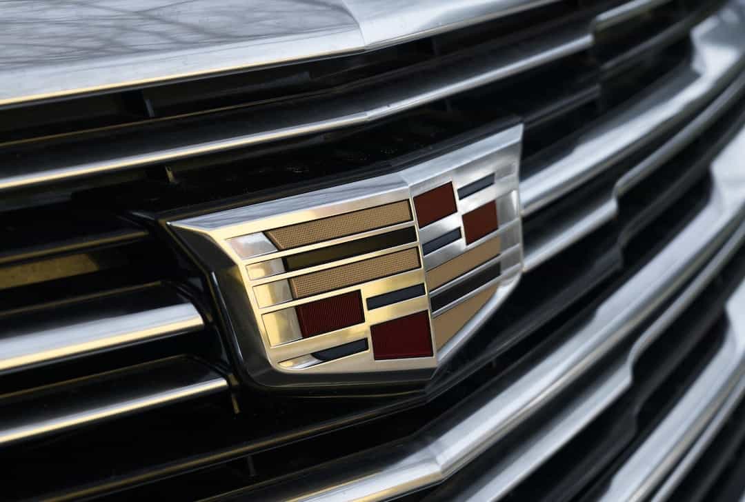
The current Cadillac logo features a simple yet elegant design that is instantly recognizable. It features a shield shape with a wreath surrounding it. Inside the shield, there are two horizontal lines that intersect with a vertical line, forming a stylized crest. The Cadillac logo is a symbol of the brand’s commitment to excellence, luxury, and innovation.
Overall, the Cadillac logo is a great representation of the brand’s values and its commitment to excellence. It is a timeless design that has evolved over time to reflect the changing times and tastes of consumers. Whether you are a fan of luxury cars or not, the Cadillac logo is one that will always be recognized as a symbol of excellence and innovation.
What Makes a Good Car Logo: Design Elements and Meanings
A car logo is one of the most recognizable elements of a car brand, and it plays a vital role in establishing the brand identity. A well-designed car logo should be memorable, timeless, and easily recognizable. It should also reflect the values and characteristics of the brand. Here are some of the design elements and meanings that make a good car logo:
1. Shape
The shape of a car logo is a crucial design element that affects its recognizability. Many car logos use simple shapes such as circles, ovals, or triangles, making them easy to remember. For example, the Toyota logo features three overlapping ellipses, which represent the company’s commitment to innovation, reliability, and excellence.
2. Color
Color is another crucial design element that can convey emotions and meanings. Many car logos use red to represent power, speed, and passion, while blue is often associated with reliability and trust. For example, the BMW logo features blue and white colors, which represent the company’s origin in Bavaria, Germany.
3. Font
The font used in a car logo can also affect its recognizability and style. Many car logos use bold and sans-serif fonts to create a strong and modern look. For example, the Audi logo features a bold sans-serif font that represents the company’s commitment to engineering excellence.
4. Symbols
Symbols are another design element that can add meaning and character to a car logo. Many car logos use symbols such as animals, plants, or other objects to represent the brand’s values or characteristics. For example, the Lamborghini logo features a raging bull, which represents strength, power, and aggressiveness.
5. Brand Identity
A well-designed car logo should also reflect the brand’s identity and values. Many car logos use visual elements that represent the brand’s history, culture, or philosophy. For example, the Mercedes-Benz logo features a three-pointed star, which represents the company’s dominance in the land, sea, and air.
6. Simplicity
Simplicity is another crucial design element that makes a good car logo. A simple and clean design makes a logo easy to recognize and memorable. For example, the Volkswagen logo features a simple and iconic “VW” design that has been unchanged since the company’s inception.
7. Uniqueness
A good car logo should also be unique and distinguishable from other brands. A unique logo helps a brand stand out from the crowd and establish its identity. For example, the Porsche logo features a unique and recognizable crest design that reflects the company’s heritage and racing pedigree.
8. Timelessness
A good car logo should also be timeless and enduring. A logo that withstands the test of time is an indicator of a strong and established brand. For example, the Ford logo features a timeless and iconic blue oval design that has been used for over 100 years.
9. Consistency
Consistency is another essential element that makes a good car logo. A logo that is consistently used across all marketing and advertising materials helps establish brand recognition and awareness. For example, the Chevrolet logo features a consistent and recognizable bowtie design that has been in existence for long.
Conclusion: An Overview of the Top 30 Car Brands and Logos
In conclusion, the car industry has evolved significantly since the first automobiles were created over a century ago. With so many car brands out there, it can be challenging to keep track of which ones are the most popular. However, by taking a closer look at the history of car logos and their evolution over time, we can gain a better understanding of the iconic brands that have shaped the industry.
